Web Design
Seven B2B Website Mistakes That Cost You Enterprise Deals

Joshua Jackai
8 min

Enterprise buyers do not ask your sales team whether your company is credible. They check your website first, quietly, usually before anyone has replied to their email. By the time a $50,000 deal reaches a call, your site has already argued for or against you. This article lists the seven B2B website design mistakes I see most often on sites that attract the right visitors and still lose them, with the fix for each. It is for founders and marketing leads at B2B companies in the US and worldwide whose deals run into five and six figures.

Illustrative photo.
How enterprise buyers actually use your website
A buyer at a larger company rarely arrives alone. One person finds you, screenshots a page into a team chat, and two or three colleagues open the link with no context at all. Each of them is asking the same three questions: what do these people do, is it for a company like ours, and can we trust them with this budget?
They answer those questions fast. In a study published in Behaviour & Information Technology, people formed a reliable opinion of a web page's visual appeal in 50 milliseconds (Lindgaard et al., 2006). And in a Stanford study of more than 2,600 people assessing real sites, the look and design of a site was the single most common factor people mentioned when judging whether to trust it (Fogg et al., 2003). None of this means the prettiest site wins. It means a site that looks careless or generic has lost before the content gets read.
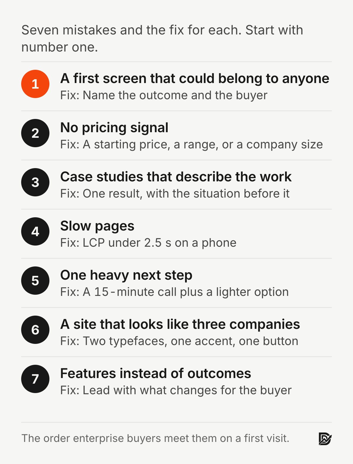
Mistake 1: A first screen that could belong to anyone
"Innovative digital solutions for growing businesses" tells a buyer nothing. Neither does a hero photo of a smiling team in a glass office that was never yours. The buyer's colleague, arriving from a forwarded link, cannot tell what you sell, for whom, or why this company rather than the two others on the shortlist.
The fix. Rewrite the headline to name the outcome and the buyer: "Website redesigns for B2B software companies with deals above $25,000." Replace the stock photo with your real work: a screenshot, a before and after, a short clip of the product. Put one real proof point in the first screen, with a name attached.

Illustration with example copy.
Mistake 2: No pricing signal at all
You do not have to publish a price list. But when a $5,000 buyer and a $50,000 buyer see identical language, you attract the wrong mix and spend discovery calls on people who cannot afford you. Meanwhile the enterprise buyer, who needs a number to put in a budget request, has nothing to work with.
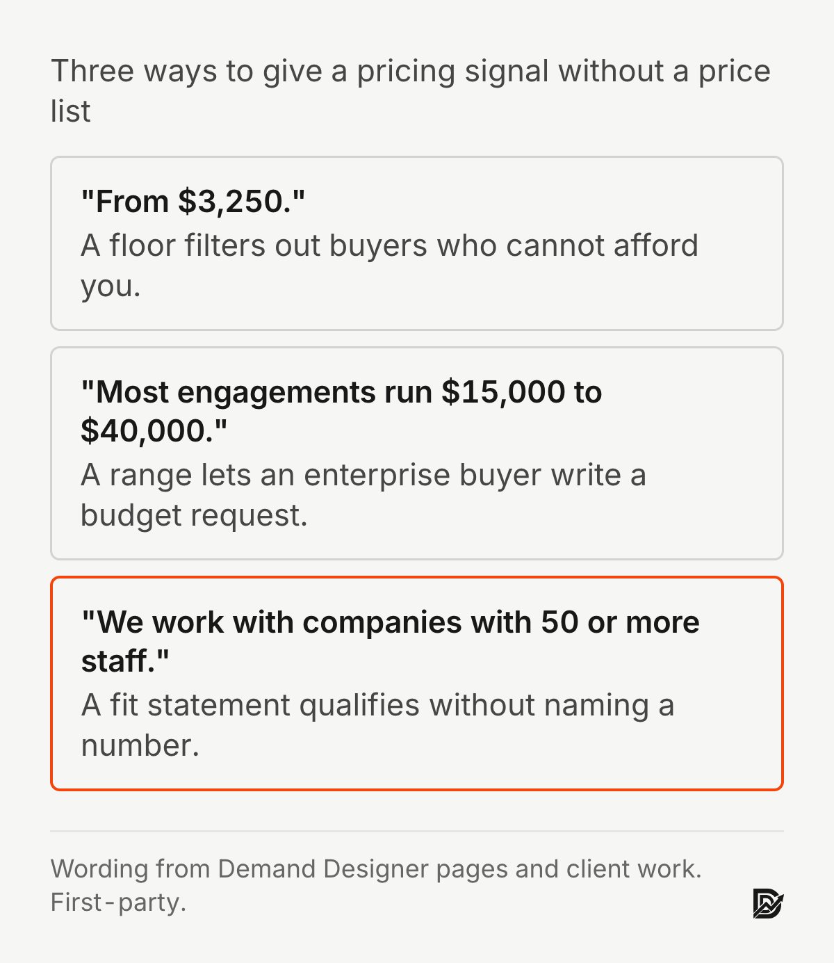
The fix. Give a signal. "From $3,250." "Most engagements run $15,000 to $40,000." "We work with companies with 50 or more staff." Any of these filters the wrong buyers out and lets the right ones justify the call. If you can publish a full pricing page, better still; buyers who know the range before the call arrive ready to decide.
Mistake 3: Case studies that describe the work, not the result
"We designed and built a new website for Company X" is a description of your invoice, not evidence. An enterprise buyer wants to know what changed for a company like theirs: the number, the timeframe, and what was true before.
The fix. Rewrite each case study around one result, with the situation before it. "Snappy Kraken went from approved designs to live HubSpot pages in three weeks because the brief was settled first." "Y Scouts' book funnel now converts 17.7% of visitors into leads." Label each study by industry and company size so a visitor can find one that looks like them. Where you have permission, name the person who signed off.
Mistake 4: Slow pages
B2B buyers read on phones, on trains, and on office networks that were never fast. In an experiment that added delays of up to 12 seconds to a website, people performed worse on their tasks and reported weaker intentions to return as the delay grew (Galletta et al., 2004). A slow site does not just lose the impatient; it lowers how everyone rates the company.
The fix. Measure Largest Contentful Paint on your key pages with PageSpeed Insights on the phone setting, and aim for Google's "good" threshold of 2.5 seconds or less. The usual culprits on B2B sites are an uncompressed hero video, oversized images, a chat widget and too many tracking scripts. Remove what you do not use, compress what you keep, and test again.
Mistake 5: One heavy next step and nothing else
Many B2B sites offer exactly one action: "Contact us," behind a form that asks for budget, timeline, company size, phone number and how you heard about them. For a buyer who is still deciding whether you belong on the shortlist, that is too much too soon, so they leave and nobody ever knows they were there.
The fix. Offer two steps. A direct one for buyers who are ready, with a plain label such as "Book a 15-minute call" and a form that asks for name, work email, company and one question about the problem. And a lighter one for buyers who are not: a short guide, a scorecard, a worked example. A controlled study of 20 web form guidelines found that improved forms were completed faster, with fewer errors and fewer attempts to submit (Seckler et al., 2014). Then say what happens after the form: who replies, and when.
Mistake 6: A site that looks like three different companies
The homepage was redesigned in 2024, the service pages in 2022, the blog never. Different fonts, button styles and spacing on each page tell an attentive buyer that nobody is in charge of the details. For an enterprise buyer, who is about to trust you with a project that has many details, that is a real signal.
The fix. Write down the rules once: two typefaces, one accent colour, one button style, one spacing scale. Apply them to the five pages buyers actually visit (home, the main service page, pricing, one case study, contact) before worrying about the rest. If the rules do not exist yet, a short design system is a day's work and pays back on every page that follows. The B2B website redesign playbook covers how to do this without losing your search rankings.
Mistake 7: Features instead of outcomes
"Responsive design, CMS integration, SEO-friendly architecture" is a list of things the buyer assumed you would do anyway. It answers none of their three questions and gives the colleague reading the forwarded link nothing to repeat in the meeting.
The fix. For every feature on the page, write the outcome next to it and lead with the outcome. "Launch in six to eight weeks, so the new site is live before your Q3 campaign." "Pages your team can edit without a developer." Then cut any feature that has no outcome worth stating.
What these mistakes cost together
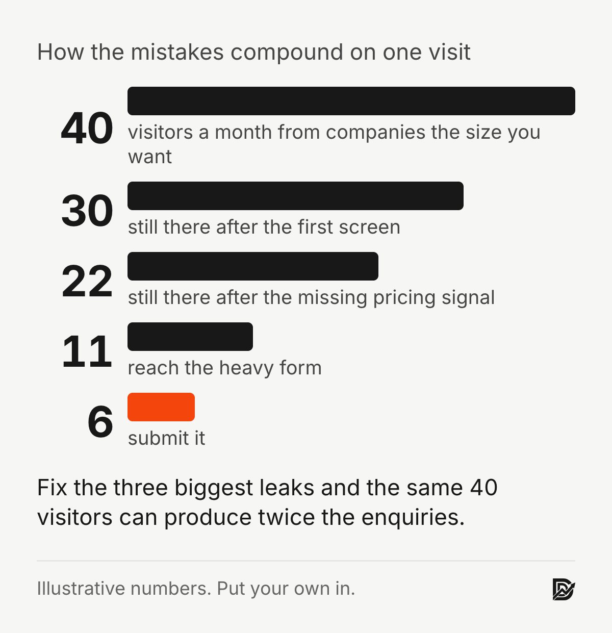
Each mistake alone loses a few buyers. Together they compound, because the same buyer meets all seven in one visit. Consider a site that brings in 40 enterprise-sized visitors a month. If the first screen loses a quarter, the missing pricing signal loses another quarter of the rest, and the heavy form loses half of those who remain, around 11 of the 40 reach the form and perhaps 6 submit it. Fix the three biggest leaks and that can double, from the same traffic and the same ad spend. That is the whole case for B2B conversion rate optimization before any new marketing.
Which mistake to fix first
If you fix one thing this week, fix the first screen. It is the cheapest change and the one every buyer sees. Then the pricing signal, then the form. Design consistency and speed come after, and both are usually a short project rather than a rewrite.
The Pipeline Leak Scorecard walks through 12 questions with your site open in front of you and ranks the leaks in about 15 minutes. If the problems run deeper than any single page, the signs you need a redesign help you decide whether a rebuild makes more sense than patching. And for the trust side specifically, how to build trust on a website covers where proof should sit on every page.
Frequently asked questions
What do enterprise buyers look for on a B2B website?
Three things, fast: what you do, whether it is for a company like theirs, and evidence you have done it before. They also look for a price signal they can take into a budget conversation and a next step that does not commit them to a sales process.
Should a B2B website show pricing?
Show a signal at least: a starting price, a typical range, or the company size you work with. Full pricing pages work well for productised services with fixed scopes. For custom work, a range plus what affects it is enough to qualify buyers and keep the right ones moving.
How fast should a B2B website load?
Aim for Largest Contentful Paint of 2.5 seconds or less on a phone, which is Google's threshold for "good." Test the pages buyers actually visit, not just the homepage.
How many calls to action should a B2B page have?
One primary action per page, with a plain label that says what happens next, plus one lighter option for visitors who are not ready to talk. More than that splits attention; fewer loses everyone who is still deciding.
Is it better to redesign the whole site or fix these mistakes one at a time?
Fix the first screen, pricing signal and form first; they are small changes with the largest effect. If the site is also slow, inconsistent and hard to edit, those are signs a redesign will cost less than a year of patches.
Sources
Peer-reviewed research
Fogg, B. J., Soohoo, C., Danielson, D. R., Marable, L., Stanford, J. and Tauber, E. R. (2003). How do users evaluate the credibility of Web sites? Proceedings of the 2003 Conference on Designing for User Experiences. doi:10.1145/997078.997097
Galletta, D. F., Henry, R., McCoy, S. and Polak, P. (2004). Web site delays: How tolerant are users? Journal of the Association for Information Systems, 5(1). doi:10.17705/1jais.00044
Lindgaard, G., Fernandes, G., Dudek, C. and Brown, J. (2006). Attention web designers: You have 50 milliseconds to make a good first impression! Behaviour & Information Technology, 25(2). doi:10.1080/01449290500330448
Seckler, M., Heinz, S., Bargas-Avila, J. A., Opwis, K. and Tuch, A. N. (2014). Designing usable web forms: Empirical evaluation of web form improvement guidelines. Proceedings of the SIGCHI Conference on Human Factors in Computing Systems. doi:10.1145/2556288.2557265
Standards and first-party data (not peer reviewed)
Google, Core Web Vitals thresholds for Largest Contentful Paint.
Snappy Kraken and Y Scouts results, and the worked example of compounding losses, come from my own client work; the example uses illustrative numbers.
Free workbook
Pipeline Leak Scorecard
Find the leaks between your traffic and your pipeline. Score your site in about fifteen minutes, with it open in front of you.
12 questions, 8 pages, 15 minutes. Free.


