Web Design
Landing Pages & Funnels
Why Your B2B Website Is Losing High-Value Clients

Joshua Jackai
8 min

Your site might look fine. Your team might be proud of it. But if prospects with five-figure budgets land on it and leave without booking a call, something is broken, and it is usually not what the last agency said. After designing and building B2B websites for companies such as Snappy Kraken, Y Scouts and Copy Chief, I see the same five failure patterns on site after site. This article explains each one, how to tell which is yours from your own analytics, and what the fix costs. It is written for founders and marketing leads at B2B companies in the US and worldwide.

Illustrative photo.
First, confirm it is the site and not the traffic
Before changing a page, check who is arriving. A site that converts poorly because it attracts students, job seekers and vendors has a traffic problem, not a design problem. Open Google Analytics 4 and look at the landing pages and sources for the last 90 days. Then, if your analytics or CRM can show it, look at enquiries by company size.
The pattern that matters is this: plenty of visits from companies the size you want, and few or no enquiries from them. That is a site that attracts the right people and loses them. If the visits are not there either, start with the keyword and content side rather than the design.
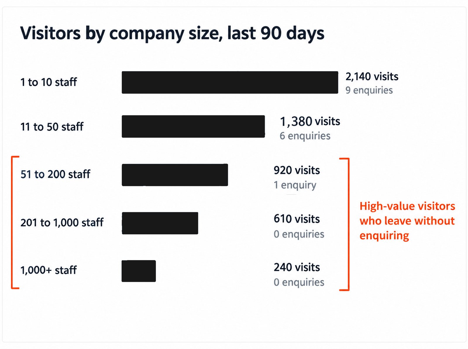
Illustration with example data: the pattern that means the site, not the traffic, is the problem.
Pattern 1: The first screen takes too long to understand
Buyers decide in seconds whether a page is for them. In a study published in Behaviour & Information Technology, people formed an opinion of a web page in 50 milliseconds, and those snap judgments held after a longer look (Lindgaard et al., 2006). If your first screen says "We help businesses grow with digital solutions," the visitor has to work to find out whether you are relevant, and most will not.
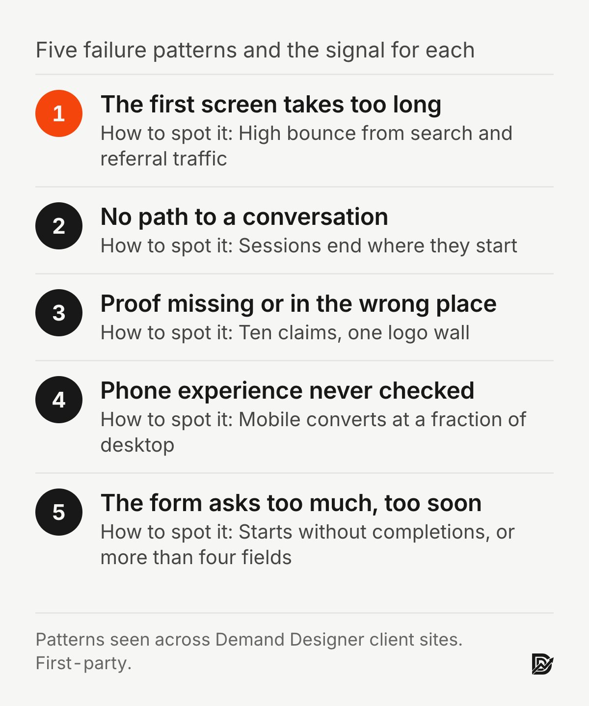
How to spot it. High bounce rate on the homepage from search and referral traffic, and short time on page. Show the homepage to someone outside the company for five seconds and ask what you sell. If they cannot answer, this is your pattern.
The fix. Rewrite the headline to name the outcome and the buyer, add one sentence on how you deliver it, and put one real proof point beside it. This is a copy change, not a redesign, and usually the highest-return hour you can spend on the site.
Pattern 2: Traffic arrives, but there is no path to a conversation
Many B2B sites are organised like a brochure: a homepage, a list of services, an about page and a contact form. Nothing on any page is designed to move a visitor toward a specific next step. Visitors read, nod, and leave, because the site never asked them to do anything in particular.
How to spot it. In GA4, look at the path from your top landing pages. If most sessions end on the page they started on, or wander to "about" and stop, there is no path. Pages with no button above the fold, or with a "Contact" link buried in the navigation, confirm it.
The fix. Give each key page one job and one button with a plain label, and make the sequence deliberate: homepage to service page to case study to call. Add a lighter step for people who are not ready, such as a guide or a scorecard, so you capture the buyer who will be ready in six weeks. The anatomy of a B2B landing page shows what that sequence looks like on one page.
Pattern 3: Proof is missing, generic or in the wrong place
B2B buyers are spending someone else's money and putting their name on the decision, so they look for reasons to trust you before reasons to buy. In a Stanford study of more than 2,600 people judging real websites, the look and design of a site was the factor they mentioned most often, in close to half of all comments (Fogg et al., 2003). Design earns consideration; evidence earns the call. Most sites have a testimonials page nobody visits and no proof where the claims are made.
How to spot it. Count the claims on your main service page, then count the pieces of evidence beside them. A page with ten claims and one logo wall has this pattern. So does a case studies section with "great to work with" quotes and no numbers.
The fix. Place proof next to the claim it supports: a named result beside the promise, a client quote about a specific outcome beside the process, a price range beside the booking button. Specific beats impressive. "A book funnel that converts 17.7% of visitors into leads" is easier to believe than "proven results." How to build trust on a website goes through this page by page.
Pattern 4: The phone experience was never checked
Enterprise buyers do a surprising share of their first research on phones: a link from a colleague, opened in a hallway. A site that was designed on a 27-inch monitor and never tested on a real phone loses those first visits before the desktop version ever gets its chance. Slow pages make it worse. In an experiment that added delays to a website, people's task performance and intention to return both fell as the delay grew (Galletta et al., 2004).
How to spot it. In GA4, compare conversion rate by device. If mobile is a fraction of desktop, open your key pages on an actual iPhone and an actual Android phone, on mobile data. Look for text that needs zooming, buttons too close together, forms that fight the keyboard, and a hero video that takes four seconds to appear.
The fix. Test and fix the five pages buyers visit most, on real phones, and get Largest Contentful Paint under 2.5 seconds. This is a short project, not a rebuild, unless the site's structure is the problem.
Pattern 5: The call to action asks for too much, too soon
"Contact us" behind a form with eight fields is a commitment, not an invitation. A buyer still deciding whether you belong on the shortlist is not ready to hand over budget, timeline and phone number. So they leave, and because they never submitted anything, the site reports nothing. A controlled study of 20 web form guidelines found that improved forms were completed faster, with fewer errors and fewer attempts to submit (Seckler et al., 2014).
How to spot it. Form starts versus form completions, if you track them. If you do not, count the fields. More than four before a first conversation is this pattern.
The fix. Ask for name, work email, company and one question about the problem, and say what happens after the form is sent. Label the button with the actual next step: "Book a 15-minute call." Move the qualifying questions to the call.
What this costs you
Put rough numbers on it, because the number is what gets the fix approved. Suppose 30 visitors a month come from companies the size you want, your site converts 2% of them, and an average engagement is worth $20,000. That is 0.6 enquiries a month, or about seven a year. Lift the conversion rate to 5% by fixing the first screen, the proof and the form, and the same traffic produces 18 enquiries a year. If you close a third of them, the difference is roughly four extra clients, or about $80,000, from traffic you already paid for.
These are illustrative figures; put your own in. The point is that a site with the right traffic and the wrong page is the cheapest thing in your marketing to fix.

What to do next
Start with the pattern your analytics point to, not the one that bothers you most. Fix the first screen and the form first; they are copy and structure changes that take days. Proof placement and phone fixes take a week or two. If three or more patterns apply and the site is also hard to edit, read the signs you need a website redesign before patching further, and the B2B website redesign playbook for how to rebuild without losing rankings.
To find your leaks in one sitting, the Pipeline Leak Scorecard walks through 12 questions with your site open in front of you and takes about 15 minutes.

Frequently asked questions
Why is my B2B website getting traffic but no leads?
Usually one of five reasons: a first screen that does not say who the site is for, no clear path to a conversation, proof that is missing or generic, a poor phone experience, or a form that asks for too much. Check conversion by source and device in Google Analytics 4 to narrow it down before changing anything.
How do I know if my website is losing high-value clients?
Look for visits from companies the size you want with few or no enquiries from them. If your CRM records company size on leads, compare it with the company sizes in your analytics or your ad platform's audience data. A gap there means the site is losing the buyers you want most.
Does a B2B website need a redesign to fix these problems?
Not usually. The first screen, the form and proof placement are copy and layout changes. A redesign makes sense when the site is also slow, inconsistent across pages, built on a platform your team cannot edit, or when three or more of these patterns apply at once.
What is a good conversion rate for a B2B website?
It depends on the traffic and the offer. Measure your own site by source over 90 days and improve against that baseline. Sites that fix the patterns above commonly move from low single digits to mid single digits on qualified traffic, which at B2B deal sizes is a large change in revenue.
Which fix should I make first?
The first screen. It is the cheapest change and every visitor sees it. Then the form, then proof placement. Speed and phone fixes follow, and a full redesign only if the structure itself is the problem.
Sources
Peer-reviewed research
Fogg, B. J., Soohoo, C., Danielson, D. R., Marable, L., Stanford, J. and Tauber, E. R. (2003). How do users evaluate the credibility of Web sites? Proceedings of the 2003 Conference on Designing for User Experiences. doi:10.1145/997078.997097
Galletta, D. F., Henry, R., McCoy, S. and Polak, P. (2004). Web site delays: How tolerant are users? Journal of the Association for Information Systems, 5(1). doi:10.17705/1jais.00044
Lindgaard, G., Fernandes, G., Dudek, C. and Brown, J. (2006). Attention web designers: You have 50 milliseconds to make a good first impression! Behaviour & Information Technology, 25(2). doi:10.1080/01449290500330448
Seckler, M., Heinz, S., Bargas-Avila, J. A., Opwis, K. and Tuch, A. N. (2014). Designing usable web forms: Empirical evaluation of web form improvement guidelines. Proceedings of the SIGCHI Conference on Human Factors in Computing Systems. doi:10.1145/2556288.2557265
Standards and first-party data (not peer reviewed)
Google, Core Web Vitals thresholds for Largest Contentful Paint.
The Y Scouts result is from my own client work. The cost example uses illustrative numbers.
Free workbook
Pipeline Leak Scorecard
Find the leaks between your traffic and your pipeline. Score your site in about fifteen minutes, with it open in front of you.
12 questions, 8 pages, 15 minutes. Free.


