Landing Pages & Funnels
Web Design
The Anatomy of a B2B Landing Page That Converts

Joshua Jackai
9 min

A B2B landing page is a single page with one job: turn a visitor who arrived from an ad, an email or a search into a booked call, a demo request or a download. It has no navigation to wander off into and no second offer. This guide lays out the seven sections of a B2B landing page in the order a buyer reads them, what each section has to do, and the copy that goes in it. The examples come from pages I built that convert at 10.1% and 17.7%, and from research on how people judge a page in the first seconds.
It is written for founders and marketing leads at B2B companies in the US and worldwide whose average deal is worth five figures or more. At that deal size, a landing page that converts 3% instead of 1% is often the difference between a campaign that pays and one that does not.

Illustrative photo.
Why a B2B landing page needs its own structure
A B2B visitor is not buying on the spot. They are deciding whether you are worth a 15-minute call, and they will have to justify that call to a colleague later. So the page has to do three things a consumer page does not: prove you understand their situation, show evidence that you have solved it before, and make the next step small and clearly described.
The order of sections matters because people decide fast and then look for reasons. In a study published in Behaviour & Information Technology, people formed an opinion of a web page's visual appeal within 50 milliseconds, and those snap judgments matched the ratings they gave after a longer look (Lindgaard et al., 2006). The sections below are arranged so the first screen earns the next scroll, and every scroll earns the one after it.

Section 1: The first screen
The first screen has one job: make the right visitor lean in and let the wrong one leave. Four elements do it.
Headline: a specific outcome for a specific buyer. "Website redesigns that book more demos for B2B software companies," not "We build digital experiences."
Supporting line: how you deliver that outcome, in one sentence. The mechanism, not a slogan.
One button: a low-commitment action with a plain label. "Book a 15-minute call" beats "Get started," because it says what happens next.
One trust signal: a client name, a result or a short quote, visible before the visitor scrolls.
Match the first screen to the traffic that lands on it. If the ad promised a free audit, the headline leads with the free audit. Mismatched messages are among the most common and cheapest-to-fix leaks on paid campaigns.
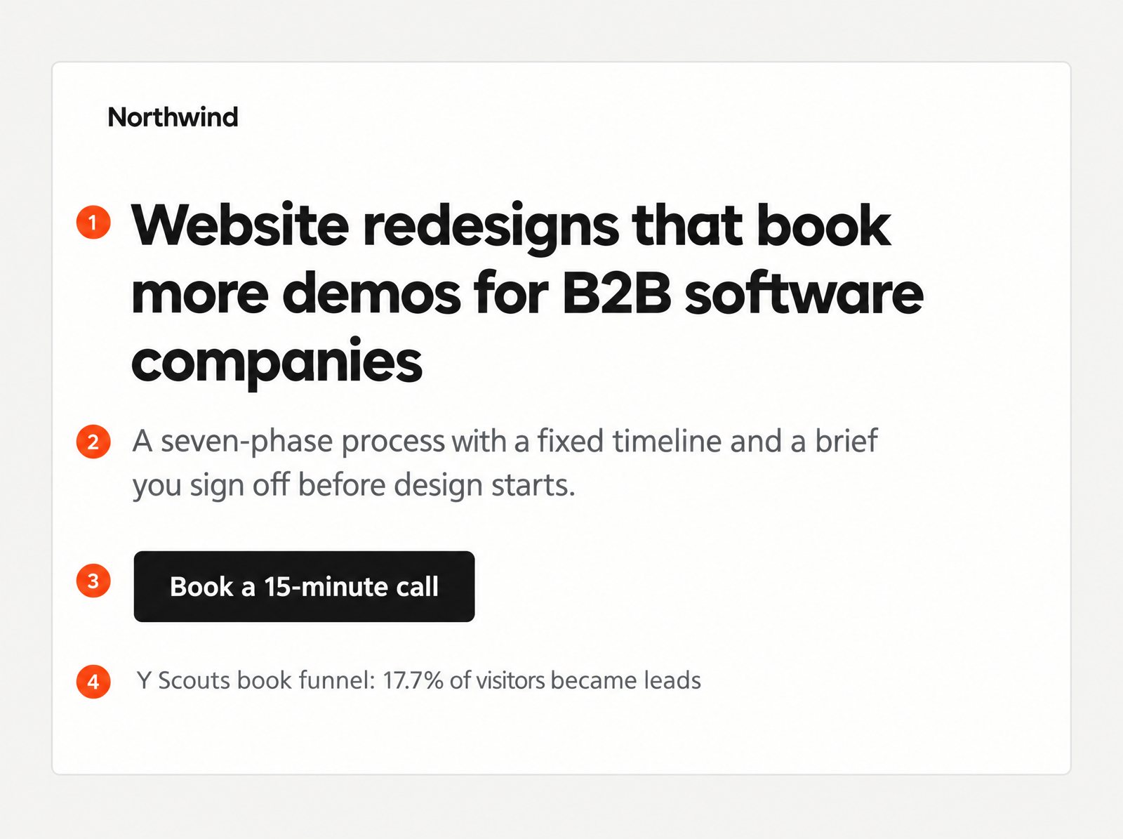
Illustration with example copy: the four elements of a first screen.
Section 2: The problem, in the buyer's words
Before you show your solution, show that you understand the situation. Name the specific problem, what it is costing, and why the usual fixes have not worked. Two or three short paragraphs are enough.
The words should come from buyers, not from you. Pull them from sales calls, support tickets, reviews of competitors and the "how did you hear about us" field on your forms. When a visitor reads their own complaint on your page, the rest of the page gets the benefit of the doubt.
There is a reason this works beyond empathy. Research on processing fluency shows that people judge things they can take in easily more favourably, and treat that ease as a sign that something is right for them (Reber, Schwarz and Winkielman, 2004). A page that describes the problem the way the buyer already thinks about it is easy to take in.
Section 3: The approach, as a system
Now the solution, framed as a process rather than a list of services. Buyers trust a sequence with steps and outputs; they are sceptical of a menu.
Three to five steps, each with a name, what happens and what the buyer gets at the end of it.
One line on what makes the process different from hiring a generic agency or a freelancer.
Timing. "Weeks one to two: audit and brief" tells a buyer more than any adjective.
Keep this section honest about scope. A buyer who learns the real timeline on the call, after reading "fast" on the page, feels misled, and misled buyers do not close.
Section 4: Proof, placed beside the claims
This is where most B2B landing pages are thin. In a Stanford study of more than 2,600 people assessing real websites, the look and feel of a site was the factor they mentioned most often when judging credibility, in close to half of all comments (Fogg et al., 2003). Design gets you considered. Proof gets you the call. The two work together when the proof sits next to the claim it supports, not on a separate testimonials page nobody visits.
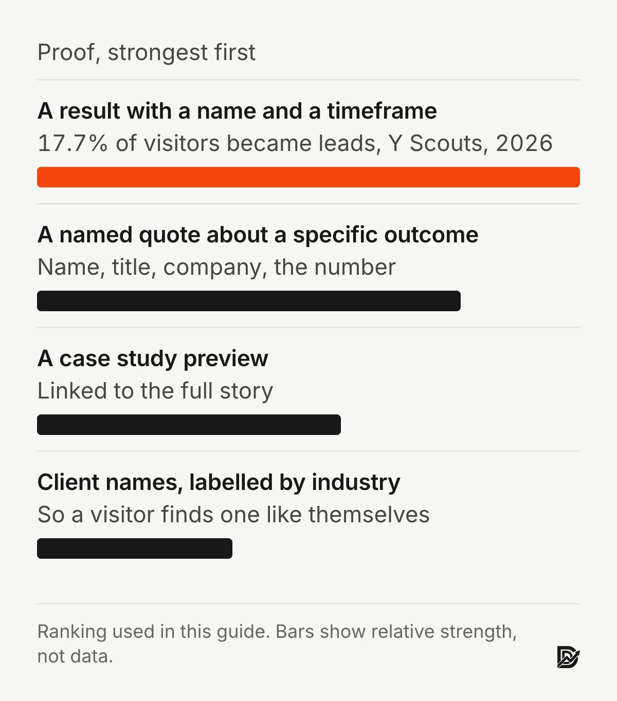
A proof stack for a B2B landing page, from strongest to weakest:
A result with a name and a timeframe. "A book funnel that converts 17.7% of visitors into leads for Y Scouts" is stronger than "proven results."
A quote from a named person with a title, about a specific outcome, not about how nice you were to work with.
A short case study preview linking to the full story.
Client names or logos, labelled by industry so a visitor can find one like themselves.
Use what you can verify. One real quote beats five generic ones, and an invented statistic is a liability the moment a buyer asks about it on the call.
Section 5: The offer and who it is for
Before the final button, state the offer plainly and say who it is for. This does two things: it raises the perceived value of the call, and it filters out poor fits before they take up a slot.
What the buyer gets: "a 15-minute call where I show you the three biggest leaks on your site and what fixing them would cost."
Who it is for: "B2B companies with an average deal above $10,000 whose site brings in enquiries but not enough of the right ones."
Who it is not for, in one line, if that saves both sides time.
Price range, if you can give one. Buyers who know the range before the call arrive ready to decide.
Section 6: The questions buyers ask before they book
A short FAQ answers the last objections: how long it takes, what it costs, what happens after the call, whether you work with companies like theirs. Write the questions the way buyers ask them, and answer in two or three sentences each.
This section is not a place to repeat the page. Each answer should add something the visitor has not read yet. If an answer only restates a section above, cut it.
Section 7: The form, and what happens after it
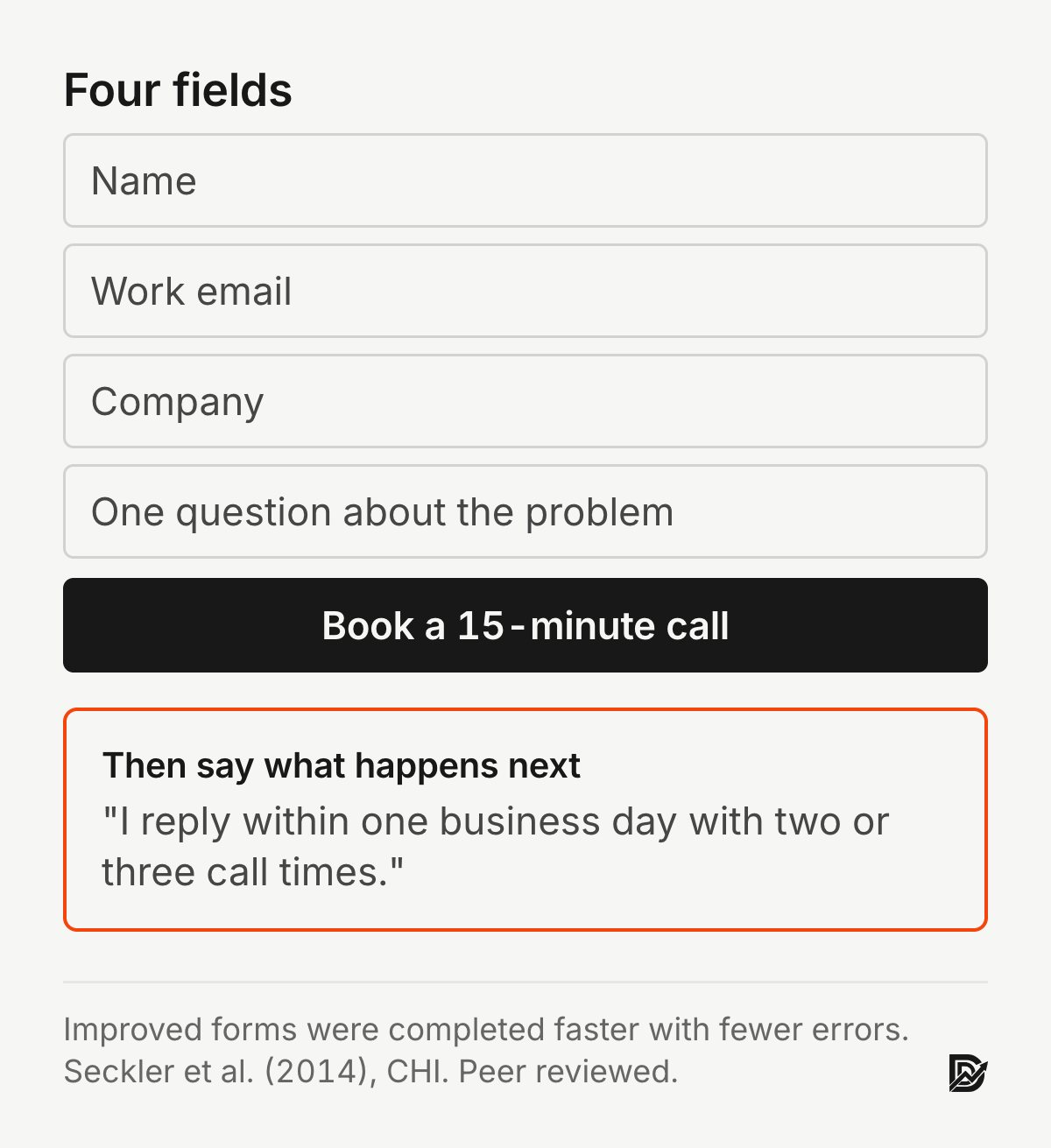
The last section is the booking or form, and it is where many pages lose the lead they just earned. A controlled study of 20 web form guidelines found that improved forms were completed faster, with fewer errors and fewer attempts to submit (Seckler et al., 2014).
Ask for what you need to reply well: name, work email, company and one question about the problem. Move the rest to the call.
Repeat the offer and the button label next to the form, so the visitor does not have to scroll up to remember what they are getting.
Say what happens next and when: "I reply within one business day with two or three call times."
Offer a lighter step for visitors who are not ready: a guide, a scorecard or a short email course.
Then test the form on a phone, read the error messages, and check the confirmation page says something more useful than "Thanks."
Two B2B landing pages and what they convert
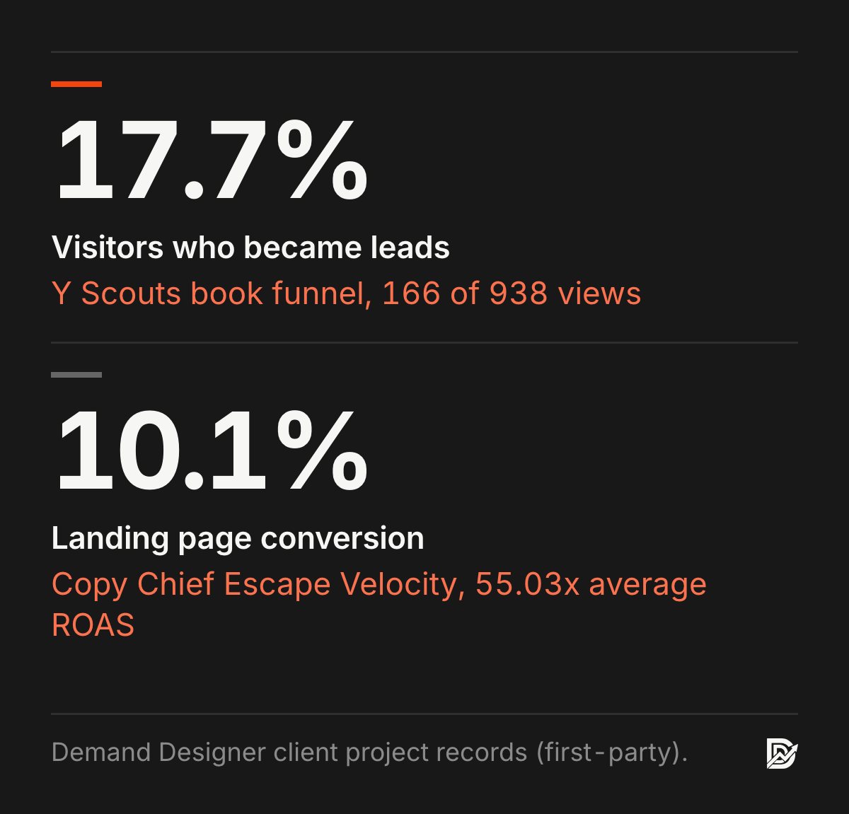
Y Scouts, executive search. The company's "Hiring on Purpose" book funnel needed to feed its sales team. The page follows the structure above: a specific offer (a free digital copy of the book), a short form with one qualifying question, and proof beside the claim. Wired from WordPress into HubSpot, it converts 17.7% of visitors into leads: 166 submissions from 938 views. See the Y Scouts project.

The real Y Scouts page, shown in an illustrative scene.
Copy Chief, Escape Velocity. A mobile-first landing page for a paid training program, fed by Meta ads whose message matched the first screen exactly. The page converted 10.1% of landing page visitors, and the campaign averaged a 55.03x return on ad spend. See the Copy Chief ads project.
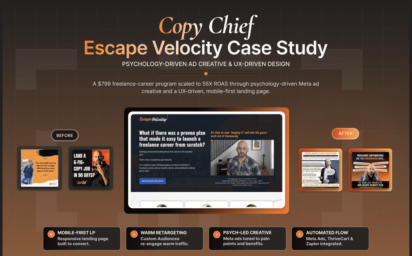
The Escape Velocity landing page and ad creative, from the project record.
Neither page is clever. Both say who the offer is for, prove it with a real result, and make the next step small.
A B2B landing page checklist
Before a page goes live, check:
Does the headline name a specific outcome for a specific buyer?
Does the first screen repeat the promise of the ad or email that sends people here?
Is there one button, with a label that says what happens next?
Is the problem described in the buyer's words?
Is the approach shown as steps with outputs and timing?
Does every major claim have proof beside it, with a name and a number?
Does the page say who the offer is for and, where possible, what it costs?
Does the form ask only what you need, and say what happens after submitting?
Does the page load in under 2.5 seconds on a phone?
Is there a lighter next step for visitors who are not ready to book?
If the page is live and you want to find where it leaks, the Pipeline Leak Scorecard walks through 12 questions with the page open in front of you. For what to do once the leaks are found, see B2B conversion rate optimization for low-traffic sites, and if you are tempted to let a tool generate the page, read why AI-generated landing pages do not convert first.
Frequently asked questions
How long should a B2B landing page be?
As long as it takes to answer the buyer's questions and no longer. For a five-figure service, that is usually the seven sections above, around 800 to 1,500 words plus proof. A page for a free download can be shorter; a page for a $50,000 engagement rarely can.
Should a B2B landing page have navigation?
No. A landing page has one job and one exit. Keep your logo (unlinked or linking to the page top), the sections, and the form. Visitors who want to explore the company can do that after they book.
What is a good conversion rate for a B2B landing page?
It depends on the offer and the traffic source. Free, low-commitment offers such as a book or scorecard can convert above 15%, as the Y Scouts page does. Paid offers and demo requests usually sit in the low single digits to around 10%. Measure your own page by traffic source and improve against that.
What is the difference between a landing page and a homepage?
A homepage serves every visitor and every goal, so it has navigation and several paths. A landing page serves one audience arriving from one source, with one offer and one action. Sending ad traffic to a homepage is one of the most common reasons B2B campaigns underperform.
How many form fields should a B2B landing page have?
Four is a good default: name, work email, company and one question about the problem. Each extra field costs leads; one qualifying question improves them. Ask for budget, timeline and company size on the call or on a short form after booking.
Sources
Peer-reviewed research
Fogg, B. J., Soohoo, C., Danielson, D. R., Marable, L., Stanford, J. and Tauber, E. R. (2003). How do users evaluate the credibility of Web sites? Proceedings of the 2003 Conference on Designing for User Experiences. doi:10.1145/997078.997097
Lindgaard, G., Fernandes, G., Dudek, C. and Brown, J. (2006). Attention web designers: You have 50 milliseconds to make a good first impression! Behaviour & Information Technology, 25(2). doi:10.1080/01449290500330448
Reber, R., Schwarz, N. and Winkielman, P. (2004). Processing fluency and aesthetic pleasure: Is beauty in the perceiver's processing experience? Personality and Social Psychology Review, 8(4). doi:10.1207/s15327957pspr0804_3
Seckler, M., Heinz, S., Bargas-Avila, J. A., Opwis, K. and Tuch, A. N. (2014). Designing usable web forms: Empirical evaluation of web form improvement guidelines. Proceedings of the SIGCHI Conference on Human Factors in Computing Systems. doi:10.1145/2556288.2557265
First-party data (not peer reviewed)
Y Scouts and Copy Chief Escape Velocity figures are from my own client work. Google's Core Web Vitals threshold for Largest Contentful Paint is an industry standard.
Free workbook
Pipeline Leak Scorecard
Find the leaks between your traffic and your pipeline. Score your site in about fifteen minutes, with it open in front of you.
12 questions, 8 pages, 15 minutes. Free.


