Web Design
Landing Pages & Funnels
The B2B Website Redesign Playbook: 7 Phases

Joshua Jackai
11 min

A B2B website redesign is a rebuild of your site's message, structure and code with one goal: more qualified buyers asking to talk to you, without losing the search traffic you already have. This B2B website redesign guide walks through the seven phases I use at Demand Designer, what each one costs in time, and how to tell whether the finished site is paying for itself. Think of it as a website redesign for conversion, not for looks.
I wrote it for founders and marketing leads at B2B companies selling in the US and internationally. If you are deciding whether you need a redesign at all, start there and come back.
What a B2B website redesign actually changes
A redesign changes four things at once: what the site says, how its pages are organised, how it looks, and the code it runs on. A refresh changes only the look. If your problem is that the right people visit and still do not get in touch, a refresh will not fix it.
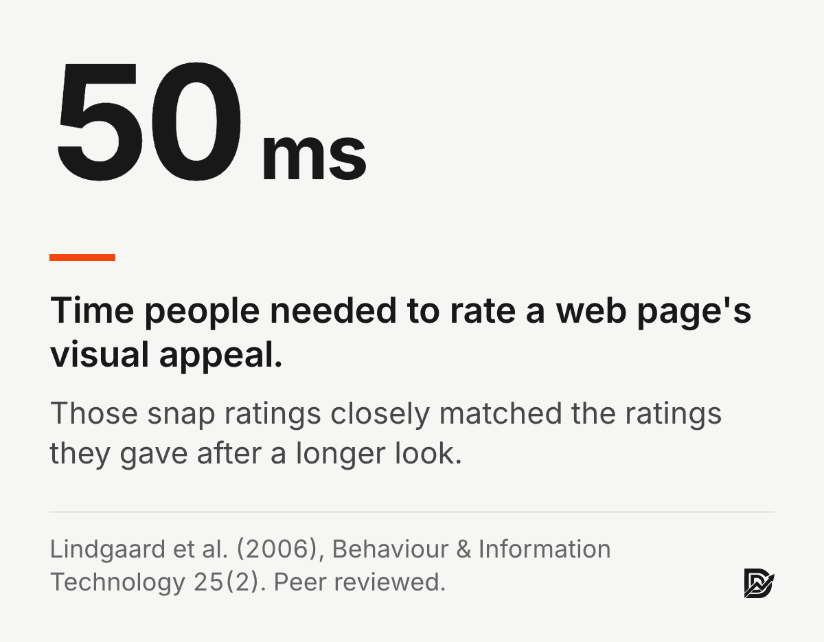
That distinction matters because first impressions form fast. In a study published in Behaviour & Information Technology, people rated the visual appeal of web pages after seeing them for 50 milliseconds, and those snap ratings closely matched their ratings after a longer look (Lindgaard et al., 2006). A Stanford study of more than 2,600 people found that the look of a site was the factor they mentioned most often when judging whether it was credible (Fogg et al., 2003). Looks open the door. Message and structure decide whether a buyer walks through it.
Why a B2B redesign is different from a B2C one
A consumer site usually has one visitor making one quick decision. A B2B site has several people from the same company visiting over weeks: the person who found you, the person who controls the budget, and often someone technical checking whether you can deliver. Each needs different proof.
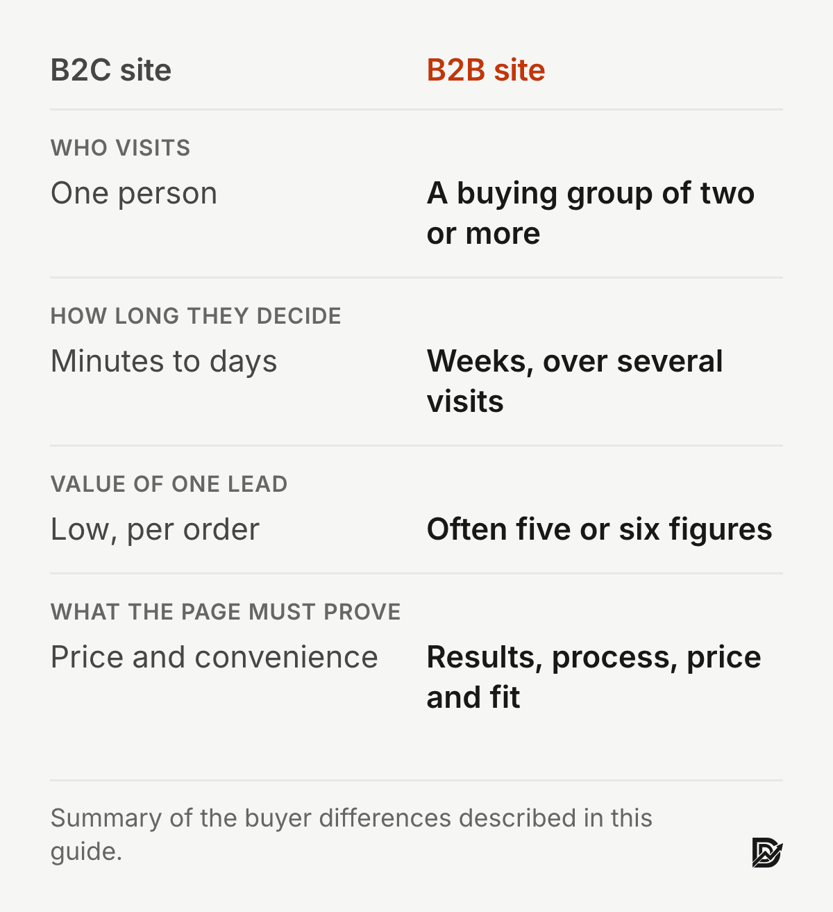
Longer decisions: pages need to work on the third visit, not only the first, so case studies, process pages and pricing detail matter more than a clever hero.
Higher stakes per lead: when one client is worth five or six figures, a small lift in enquiries changes revenue more than a large lift in traffic.
Quieter buyers: most visitors are not ready to book a call yet, so the site needs a second, lighter action for them, such as a guide, a calculator or a newsletter.
Set the B2B website redesign strategy before the scope
A redesign strategy is three decisions made before anyone talks about pages or tools: the business result you want, the buyer you want it from, and the number that will prove it worked. Skip them and scope grows to fill the budget.
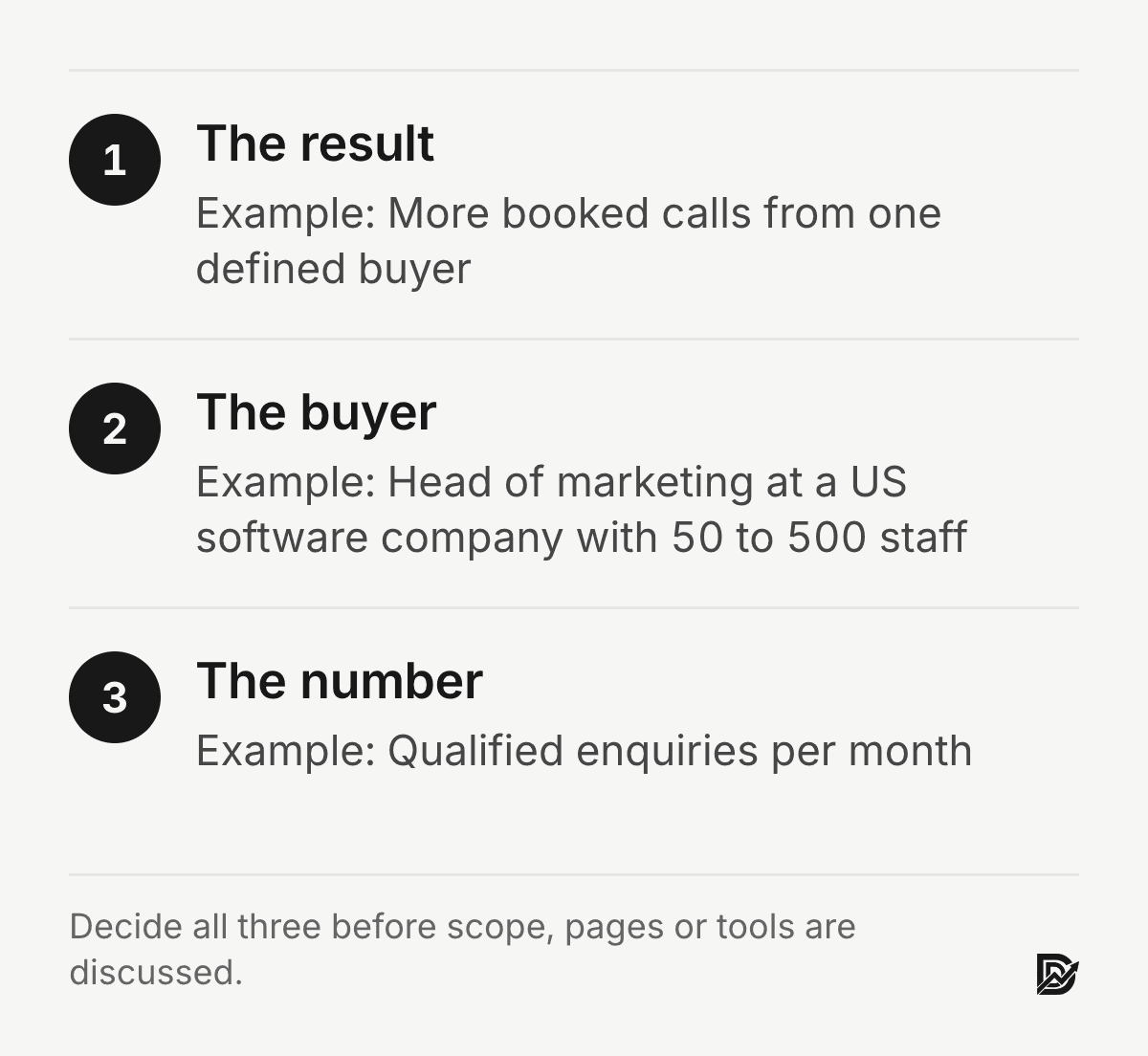
The result: more booked calls from a defined buyer, a higher share of enquiries that fit your price range, or entry into a new market such as the US or Europe. Pick one main result; a site built to do everything does nothing well.
The buyer: the role, company size, industry and region of the person who signs. A site that speaks to "everyone" reads as generic to the people who matter.
The number: qualified enquiries per month is usually the right one. Traffic and time on page are useful clues but poor goals, because they can rise while sales fall.
Write these down and share them with whoever builds the site. They settle most arguments about design, copy and features before those arguments start.
Phase 1: Audit the current site before changing anything
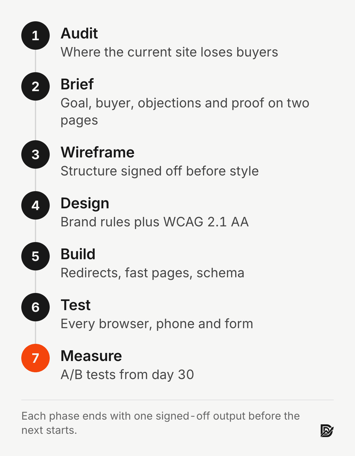
Start with evidence, because a design decision made without it is a guess. I spend the first week of every redesign finding out exactly where the current site loses buyers:
Google Analytics 4: the pages people leave from most, time spent on your main service pages, and the path real leads followed before they contacted you.
Heatmaps from Hotjar or Microsoft Clarity: what gets clicked, what gets ignored, and how far down the page people read.
Google Search Console: the searches that bring people in, and whether each landing page answers the question behind that search.
A five-second test: show the homepage to someone outside the company for five seconds and ask what you sell. If they cannot answer, the main message comes first on the fix list.
An SEO inventory: every URL that earns traffic or links, so none of it disappears in the rebuild.
The output is a short list of leaks, ranked by how many buyers each one costs. Everything after this phase exists to close those leaks.
Phase 2: Turn the findings into a conversion brief
The brief is the most important document in the project, and it fits on two pages. It answers five questions:
What one action should each page drive: a booked call, a demo, a download?
Who exactly is the buyer? "Marketing leaders" is too loose. "Head of marketing at a US software company with 50 to 500 staff" is something a designer can work with.
Which three objections stop that buyer, and which section of which page answers each one?
What proof exists today: case studies with numbers, client logos you have permission to use, recorded testimonials?
What is the single most important message, what comes second, and what is supporting detail?
A designer handed this brief produces stronger work in less time. A designer told to make the site "modern and clean" produces something that looks fine and sells poorly. If you want a template for the sections a sales page needs, the anatomy of a high-converting B2B landing page covers them one by one.
Phase 3: Wireframe the structure, not the style
Wireframes are plain grey layouts with no colour or brand fonts. Their job is to turn the brief into page structure. They settle what sits in the first screen, how long each page runs and the order of sections. They also fix where the calls to action go and how the phone layout differs from desktop.
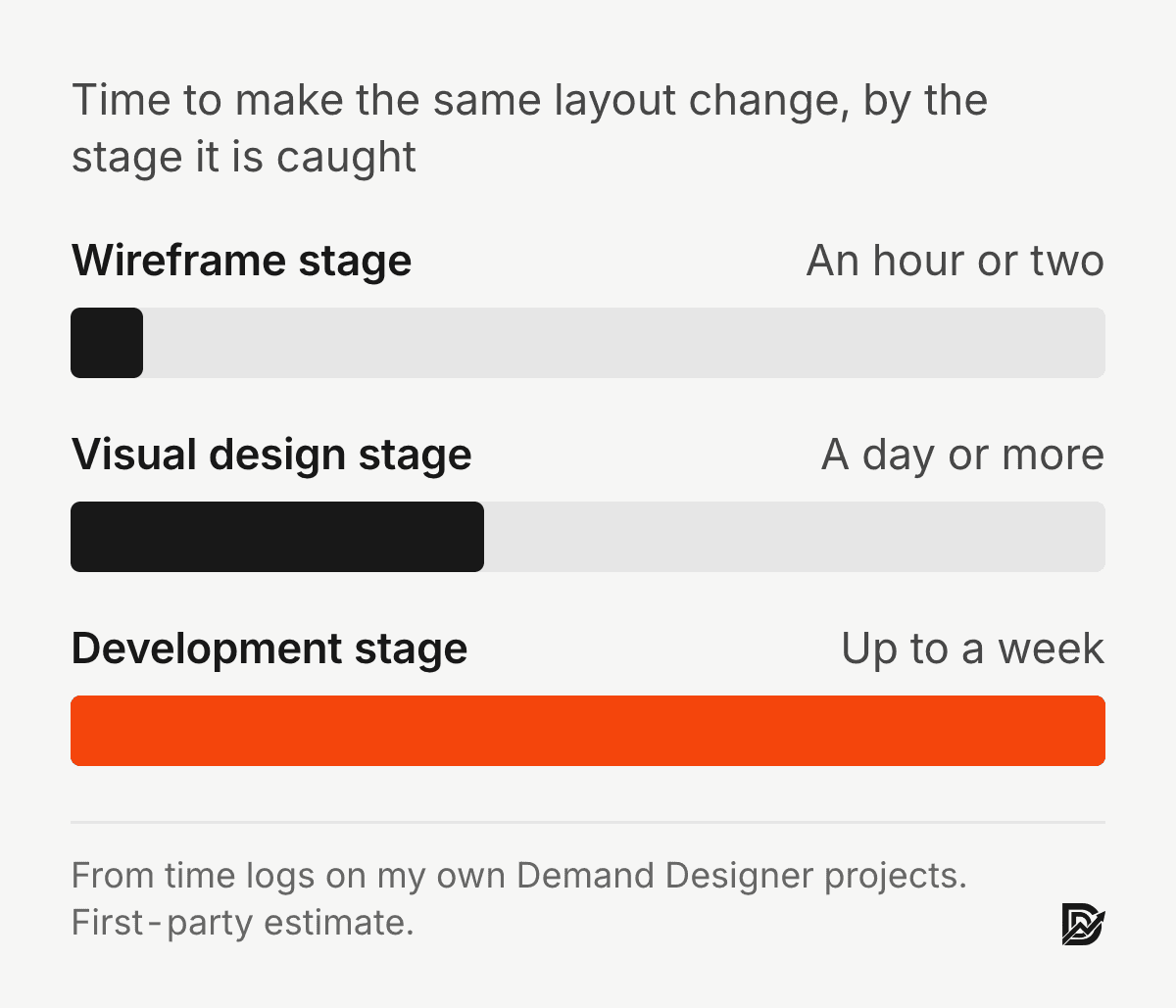
Get sign-off here. In my projects, a change at the wireframe stage takes an hour or two; the same change after visual design takes a day or more, and after development it can take a week. The website redesign process guide breaks down who approves what at each stage.
Phase 4: Design to the brief and to accessibility standards
Visual design on a sales-focused site works inside three limits:
Conversion basics: buttons that stand out from the background, a clear visual order that leads the eye to the next step, and space around the parts that matter.
Your brand rules: the same type, colour and image style on every page.
Accessibility: meeting WCAG 2.1 AA. It helps every visitor, it supports search performance, and for US companies it reduces ADA risk.
These are the mistakes I fix most often on B2B sites. Buttons blend into the page. Body text is 14px or smaller. Image-heavy sections pull attention from the offer. Menus carry eight or more top-level links. I cover more of these in the design mistakes that cost B2B companies large contracts.
Phase 5: Build for speed and keep every ranking you earned
Development is where most redesigns lose search traffic, and it is the easiest loss to prevent. Four rules:
Redirect every changed URL with a 301, so old links, bookmarks and search results still land on the right page. The migration guides show how to map them.
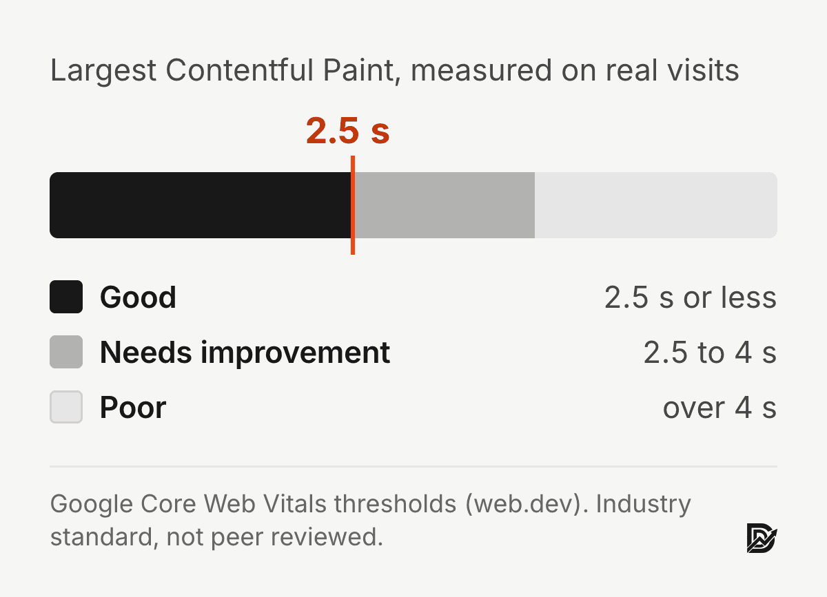
Keep the site at least as fast as before. Rich visuals slow pages down; aim for a Largest Contentful Paint under 2.5 seconds, which is the threshold Google uses for a good score.
Write titles, meta descriptions, headings and internal links on purpose instead of copying them across from the old site.
Add structured data (
Organization,Service,FAQPage,Article) so search engines and AI assistants understand what each page is about.
The platform choice matters here too. HubSpot, WordPress, Framer and Shopify each make some of this easy and some of it hard; the platform comparison lays out the trade-offs for B2B teams.
Phase 6: Test every path before launch
Before the new site goes live, I check:
Chrome, Safari, Firefox and Edge.
Real phones, especially iPhones, because iOS Safari shows layout problems the other browsers hide.
Every way a visitor can become a lead: each form submitted, each button pressed, each path followed to the end.
Page speed on phone and desktop with PageSpeed Insights.
Tracking: GA4, the tag manager and every conversion event firing correctly, so you can measure the redesign from day one.
The full list lives in the website redesign checklist.
Phase 7: Measure, then improve the pages that matter
Launch starts the measuring; it does not end the project. About 30 days in, run A/B tests on the pages with the most traffic. These three tests usually teach the most:
The hero headline: a specific promise against a stated result.
Button wording.
How proof is shown: quotes, case study previews or headline numbers.
Give the numbers two to four weeks to settle; the first week after launch is too noisy to act on. My B2B conversion rate optimization guide covers how to run these tests without guessing.
B2B website design best practices to build in from the start
These are the B2B website design best practices I build into every project, because each one is far cheaper to include during a redesign than to add later:
Say what you do and for whom in the first screen. One plain sentence, then the main call to action.
Give every service its own page. Buyers search for the service, not your company name, and a single "Services" page cannot rank for all of them.
Put proof next to claims. A number, a client name or a short quote beside each promise does more than a testimonial section at the bottom.
Show pricing or a price range. Buyers who see a range self-qualify before they call, which saves both sides time. My pricing page shows how that can look.
Offer two actions, not one. A primary action such as booking a call, and a lighter one such as a guide or cost calculator for buyers still researching.
Keep forms short. Ask only for what you need to reply; every extra field costs enquiries.
Write for people who skim. Clear headings, short paragraphs and lists let a busy buyer find their answer in seconds.
If your current site breaks several of these, that is usually why it is losing high-value clients despite steady traffic.
What this looks like on real projects
Two examples from my own work show what the phases produce when they are followed:
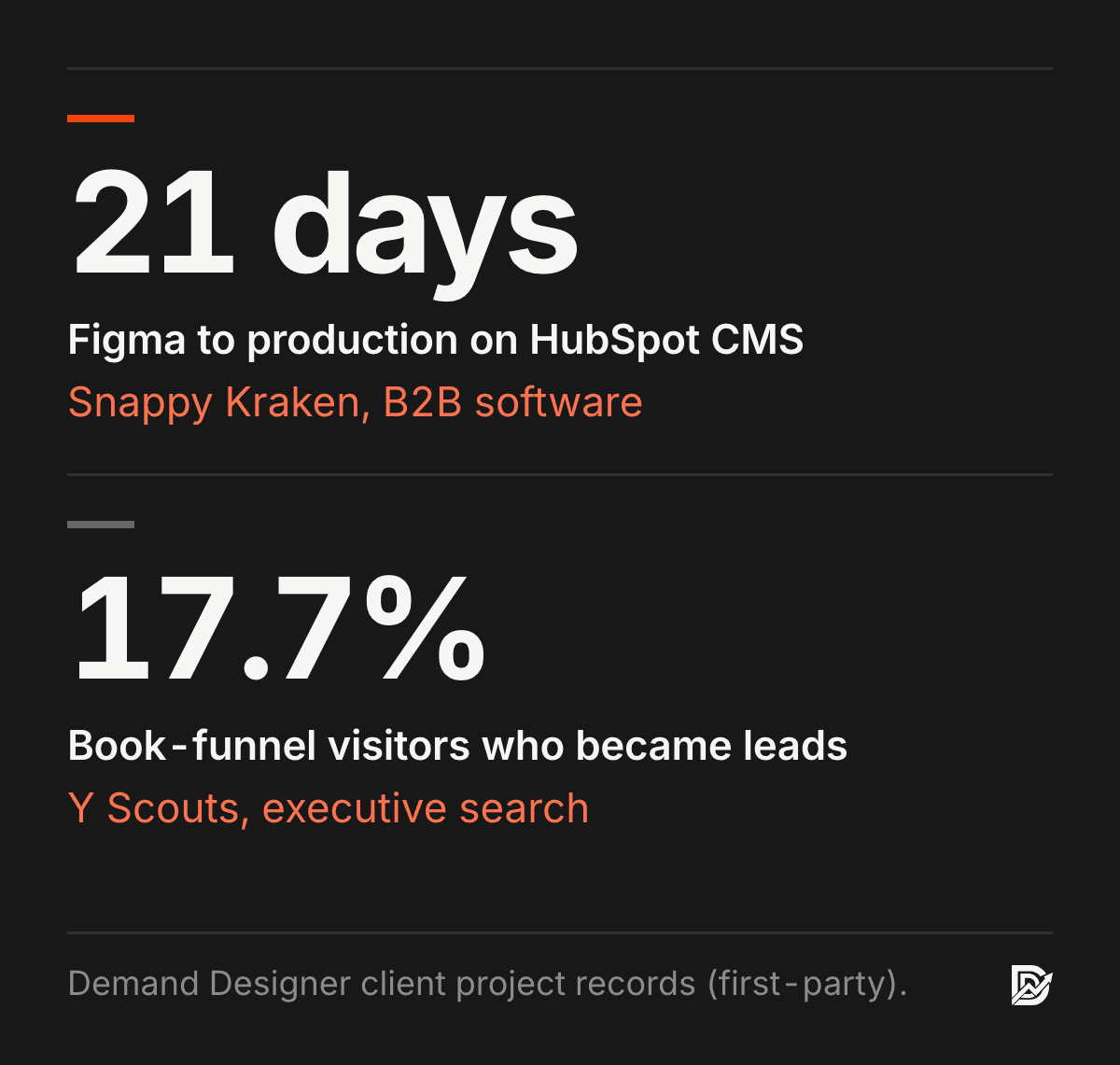
Snappy Kraken, a B2B software company serving financial advisors, went from approved Figma designs to production pages on HubSpot CMS in three weeks, because the brief and wireframes were settled before a line of code was written.
Y Scouts, an executive search firm, got four lead-capture pages wired from WordPress to HubSpot, including a book funnel that converts 17.7% of its visitors into leads.
What a B2B website redesign costs, and when it pays back
At Demand Designer a B2B website costs from $1,650 for a one-page site, $3,750 for a focused five-page build, and $11,550 for a ten-page lead-generation site with copy, SEO and a booking flow on Framer. Quotes over $15,000 are scoped on a call. Agencies typically quote $10,000 to $50,000 or more for similar scope. The B2B website cost guide and the website redesign cost guide break both down line by line.

The payback is simple arithmetic. If your average deal is worth $15,000 to $50,000, one extra client a month covers the redesign within a quarter. That is why I judge a redesign on qualified enquiries, not on traffic or on how the new site looks.
Frequently asked questions
How long does a B2B website redesign take?
Most B2B redesigns take 6 to 12 weeks. A focused site of five to ten pages can launch in 4 to 6 weeks when the brief and content are ready; larger sites with many service pages and a CMS migration take longer. The website redesign timeline guide shows where the weeks go.
How much does a B2B website redesign cost?
With a focused studio like mine, a B2B redesign starts at $3,750 for five custom pages on Framer and $11,550 for a ten-page lead-generation site, depending on page count and integrations; quotes over $15,000 are scoped on a call. Agencies usually charge $10,000 to $50,000 or more. Budget separately for hosting, software and a few hours a month of updates after launch.
Will a website redesign hurt my search rankings?
Only if URLs change without redirects or pages lose their content and headings. Map every old URL to a new one with a 301 redirect, keep or improve the content on pages that rank, and check Search Console weekly for the first two months after launch.
Which platform is best for a B2B website?
It depends on who will edit the site and which CRM you use. HubSpot suits teams already on HubSpot CRM, WordPress suits teams that want the widest plugin choice, and Framer suits teams that want fast, design-led sites they can edit without a developer.
What makes a B2B redesign different from a B2C redesign?
B2B buyers decide slowly and in groups, and each client is worth more. So a B2B site needs deeper proof, such as case studies, pricing and process detail, plus a lighter action for visitors who are not ready to book a call.
Sources
Peer-reviewed research
Lindgaard, G., Fernandes, G., Dudek, C. and Brown, J. (2006). Attention web designers: You have 50 milliseconds to make a good first impression! Behaviour & Information Technology, 25(2). doi:10.1080/01449290500330448
Fogg, B. J., Soohoo, C., Danielson, D. R., Marable, L., Stanford, J. and Tauber, E. R. (2003). How do users evaluate the credibility of Web sites? Proceedings of the 2003 Conference on Designing for User Experiences. doi:10.1145/997078.997097
Standards and price data (not peer reviewed)
W3C, Web Content Accessibility Guidelines (WCAG) 2.1. Google, Core Web Vitals thresholds for Largest Contentful Paint.
Demand Designer prices and project results are first-party figures from my own work, current as of October 2026.
Free workbook
Pipeline Leak Scorecard
Find the leaks between your traffic and your pipeline. Score your site in about fifteen minutes, with it open in front of you.
12 questions, 8 pages, 15 minutes. Free.


