Web Design
7 Website Redesign Process Steps: Complete 2026 Guide

Joshua Jackai
14 min

Short answer: A website redesign runs in seven steps: audit the current site, set measurable goals, plan the structure, wireframe and test, design templates, build and quality-check, then launch and measure for 90 days. The first three happen before any design. Google advises keeping redirects for at least one year after a move.
Most disappointing redesigns are not badly designed. They are badly sequenced: design starts before anyone has agreed what the site is for, and the rest of the project spends its budget correcting that. I am Joshua Jackai, founder of Demand Designer, a US studio that redesigns B2B websites on Framer, HubSpot and WordPress, and this is the sequence I follow on every project.
Key takeaways
Steps 1 to 3 happen before design, and they are the steps rushed timelines cut first because nobody can see them.
Agency guides recommend three to six months of analytics for the audit and three to five measurable goals (lowcode.agency, September 2026).
Four or five test participants find about 80 percent of usability problems (Virzi, 1992), so a wireframe test is cheap.
A Core Web Vitals pass needs a largest paint under 2.5 seconds and a layout shift under 0.1 (web.dev).
Redirects from old URLs should stay for at least one year (Google Search Central).
Step | What you receive | What I need from you |
|---|---|---|
1. Audit the current site | A baseline sheet of traffic, conversions, top pages and speed | Analytics access and an honest account of what is not working |
2. Set measurable goals | A brief with three to five goals and one named decision-maker | The goals sentence signed off |
3. Plan the structure | Sitemap, page inventory and old-to-new URL map | Decisions on pages to keep, merge or drop |
4. Wireframe and test | Low-fidelity layouts tested with real people | One round of feedback on structure |
5. Design the templates | Visual system and key templates | Consolidated feedback in the agreed turnaround |
6. Build and quality-check | A staging site with tracking and forms working | Final copy, assets and staging review |
7. Launch and measure | Live site, redirects and a 90-day report | Search Console access and a review call |
1. Audit the current site: best for finding out what is worth keeping
An audit records what the current site does before anyone changes it: traffic, conversions, the pages carrying value, speed and the questions buyers ask before they call. Agency guidance puts the analytics pull at three to six months and the audit at two to three weeks for a typical business site (lowcode.agency, September 2026).
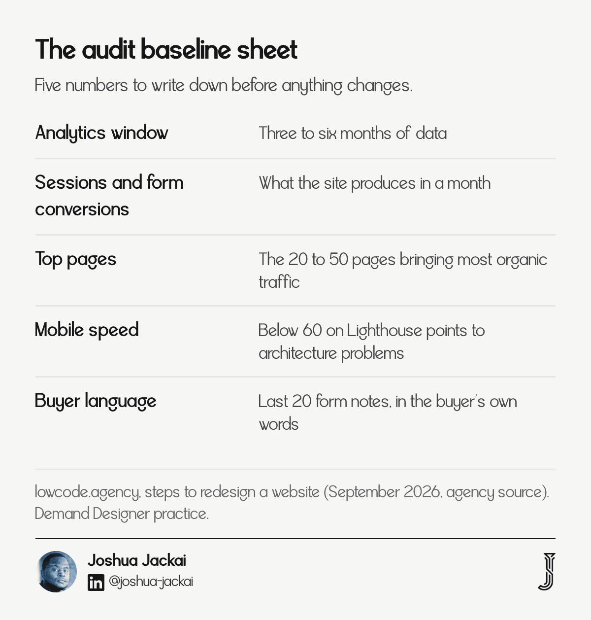
Input: Three to six months of analytics, Search Console, and the current sitemap
Output: A one-page baseline of sessions, form conversions and the 20 to 50 pages that bring most organic traffic
Owner: Whoever can open analytics, usually the head of marketing
Skipped when: The redesign is treated as a visual job
The audit is what stops the new site from confidently repeating the old site’s mistakes. It also protects the pages that already earn their place. A page that brings steady organic visits and form submissions gets rebuilt carefully, and a page nobody has opened in a year gets merged or removed. Without the baseline there is nothing to compare against in step 7, so any improvement or loss stays a matter of opinion.
I add two checks that agency guides mention less often. First, I read the last 20 form submissions or sales call notes to hear how buyers describe the problem in their own words, because those phrases become headlines. Second, I list every page that other sites link to, since those URLs need a redirect. Technical checks such as a Lighthouse run on the key pages sit here too. The same agency guide treats a mobile performance score below 60 as a sign of architectural problems (lowcode.agency, September 2026).
“Before the redesign starts, write down what the current site produces in a month. That number is the only thing the new site can be judged against,” stated Joshua Jackai, founder of Demand Designer.
2. Set measurable goals: best for deciding what the site is for
This step turns “make it look modern” into three to five goals with a baseline, a target and a date. A usable goal reads like: increase monthly organic enquiries from 45 to 75 within 90 days of launch. The brief also names one decision-maker who signs off every phase (lowcode.agency, September 2026).

Input: The audit baseline and the business target for the year
Output: A signed brief with three to five goals and one named approver
Owner: The decision-maker, not the committee
Skipped when: Everyone agrees the old site “feels dated”
Goals are where most redesigns are quietly won or lost. A site without a stated metric gets judged on taste, and taste changes with whoever joins the next review call. I ask for the single metric the site must move, and I tie it to a number someone already tracks: demo requests, qualified leads or booked calls. Secondary goals such as speed and accessibility are written down too, because they are measurable and they affect rankings and conversion.
I also write the goals so a stranger could check them: a number, a source such as analytics or the CRM, and a date. If the metric cannot be read from a tool you already use, the goal is not ready.
The brief also fixes what is out of scope. Adding a client portal in week eight is the usual way a four-week project becomes a ten-week one. A written brief lets me say “that is a phase two item” without it sounding like an argument.
“A redesign without a stated metric gets judged on taste, and taste changes with every new reviewer,” stated Joshua Jackai, founder of Demand Designer.
3. Plan the structure: best for protecting rankings before design starts
Structure planning produces three documents: a sitemap, a page inventory and an old-to-new URL map. The URL map matters most, because Google’s own move guidance lists “prepare a URL mapping from old URLs to new ones” as a separate step before any redirect goes live (Google Search Central).
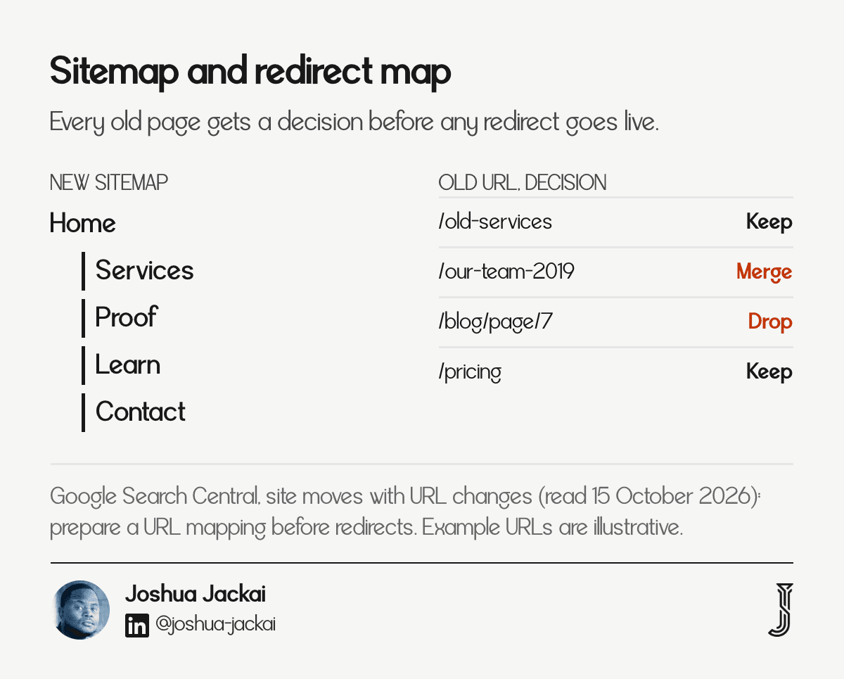
Input: The audit’s page list and the goals from step 2
Output: Sitemap, page inventory with a keep, merge or drop decision per page, and a redirect map
Owner: Me for the map, you for the keep and drop decisions
Skipped when: The new site is built first and redirects are guessed afterwards
This is the step where the site is actually decided. Everything visual afterwards is execution. I group pages by the job a buyer is doing: understanding the offer, comparing options, checking proof and booking a call. Then I check that each job has a clear path to one conversion action. If two pages compete for the same query, one of them is merged into the other and the weaker URL redirects to it.
Google also sets expectations on timing. For medium-sized sites, it says it can take a few weeks or more before the new URLs show gradually in results (Google Search Central). That is a reason to finish the map now, because fixing missing redirects after launch means running with lost visits during that period. I also keep a column for the reason each page stays, merges or goes, so the decision can be reviewed later without anyone relying on memory.
4. Wireframe and test: best for finding layout problems while they cost almost nothing
A wireframe is a low-fidelity layout of a page that shows content order and calls to action without colour, type or photography. Testing it with a handful of people costs hours, not weeks. Virzi found that four or five participants uncover most usability problems (Human Factors, 1992).
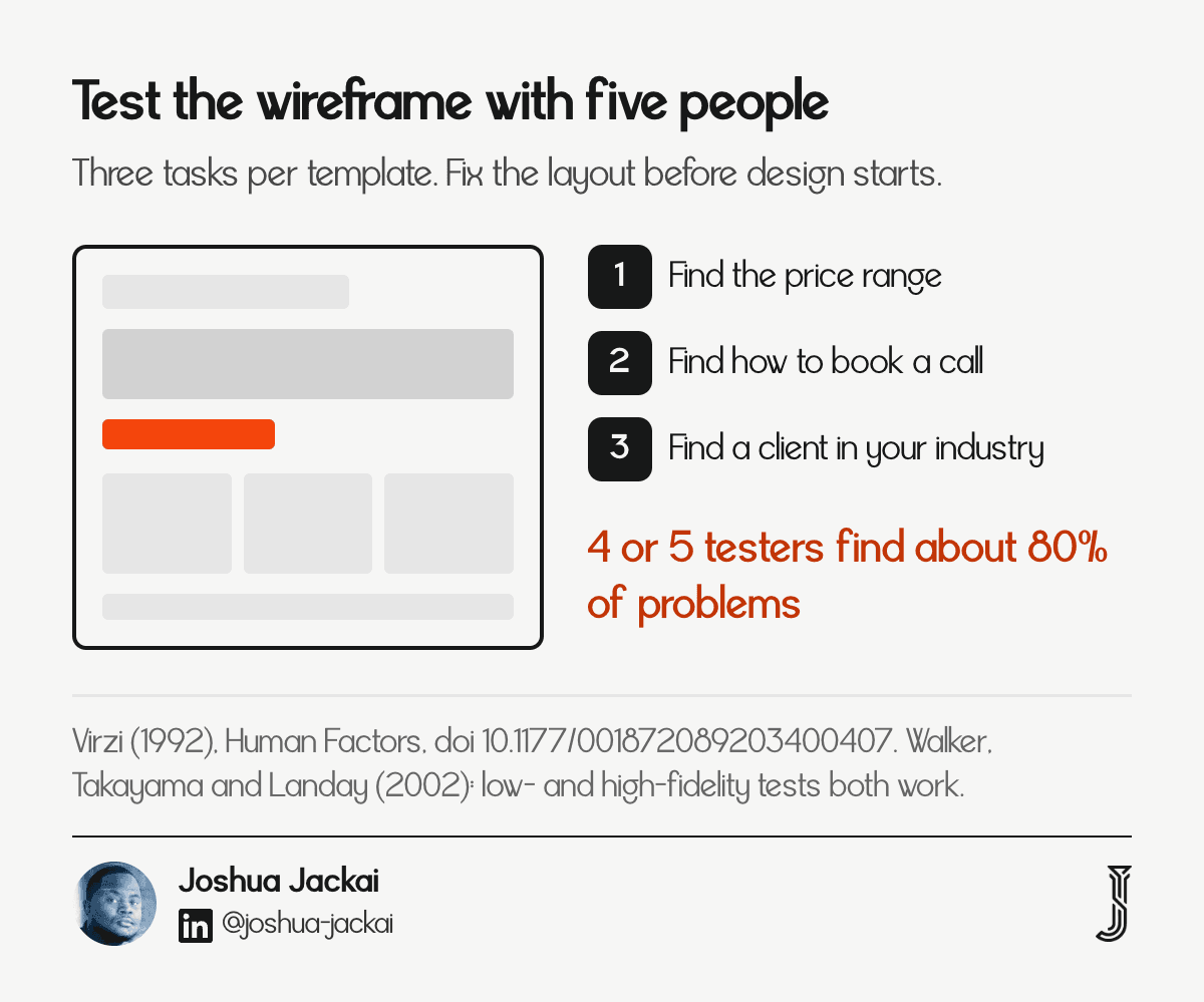
Input: The sitemap and the key page types: home, service, proof and contact
Output: Wireframes for each template, plus notes from a five-person test
Owner: Me for the layouts, you for recruiting testers from your customer list
Skipped when: Design starts from a template or an inspiration board
Wireframes answer a question that people often ask in search: which tool, and is it UX or UI? The tool matters little; Figma, a paper sketch and Framer all work. Wireframing is a UX activity because it decides order, hierarchy and paths, while UI work comes later in step 5. Fidelity matters less than people think. Walker, Takayama and Landay compared sketched and HTML prototypes in a controlled experiment and found that both worked for testing.
“Low- and high-fidelity prototypes are equally good at uncovering usability issues,” wrote Walker, Takayama and Landay (Human Factors and Ergonomics Society, 2002).
The test itself is plain. I show the wireframe on a laptop or phone, ask the person to talk through what they expect, and note where they hesitate. No special software is needed.
I give testers three tasks per template, such as “find the price range” or “find out how to book a call”. When two of five people stall at the same place, the layout is changed before any visual design is spent on it. The lowcode.agency guide suggests five to eight unmoderated tests on the wireframes; either count works for a business site (lowcode.agency, September 2026).
5. Design the templates: best for keeping the cost sane and the site consistent
Design starts with the visual direction, then the key templates, then the remaining pages. Designing templates instead of individual pages keeps cost and review time predictable. Visitors form a visual-appeal judgment within 50 milliseconds, and that early rating matches what they say after longer viewing (Lindgaard et al., 2006).
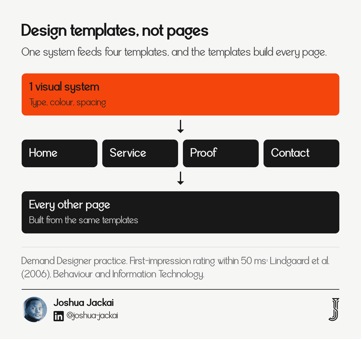
Input: Approved wireframes, brand assets, and any existing guidelines
Output: A visual system, designs for each template, and mobile layouts
Owner: Me for design, the named decision-maker for consolidated feedback
Skipped when: A timeline compresses and design absorbs the strategy steps
The 50 millisecond result comes from a laboratory study of rated screenshots, not from a live site, so it describes first impressions rather than conversion. I still use it as a reason to spend effort on the first screen of every template: a clear headline, one primary action and a real proof point above the fold (Lindgaard, Fernandes, Dudek and Brown, 2006).
Review discipline matters as much as design skill here. I ask for one set of consolidated feedback from the named approver, within an agreed turnaround, and two substantive rounds are normal when steps 1 to 4 were done properly. A third or fourth round usually signals that something in the goals or structure was never settled.
On AI tools: ChatGPT and similar tools can produce a plausible page layout in minutes. They cannot know your audit baseline, your goals or your redirect map, so I treat them as a sketching aid for step 4 and 5, never as a replacement for steps 1 to 3.
“A generated layout answers the question ‘what could this page look like’. It cannot answer ‘what should this site do’,” stated Joshua Jackai, founder of Demand Designer.
6. Build and quality-check: best for catching what breaks before visitors do
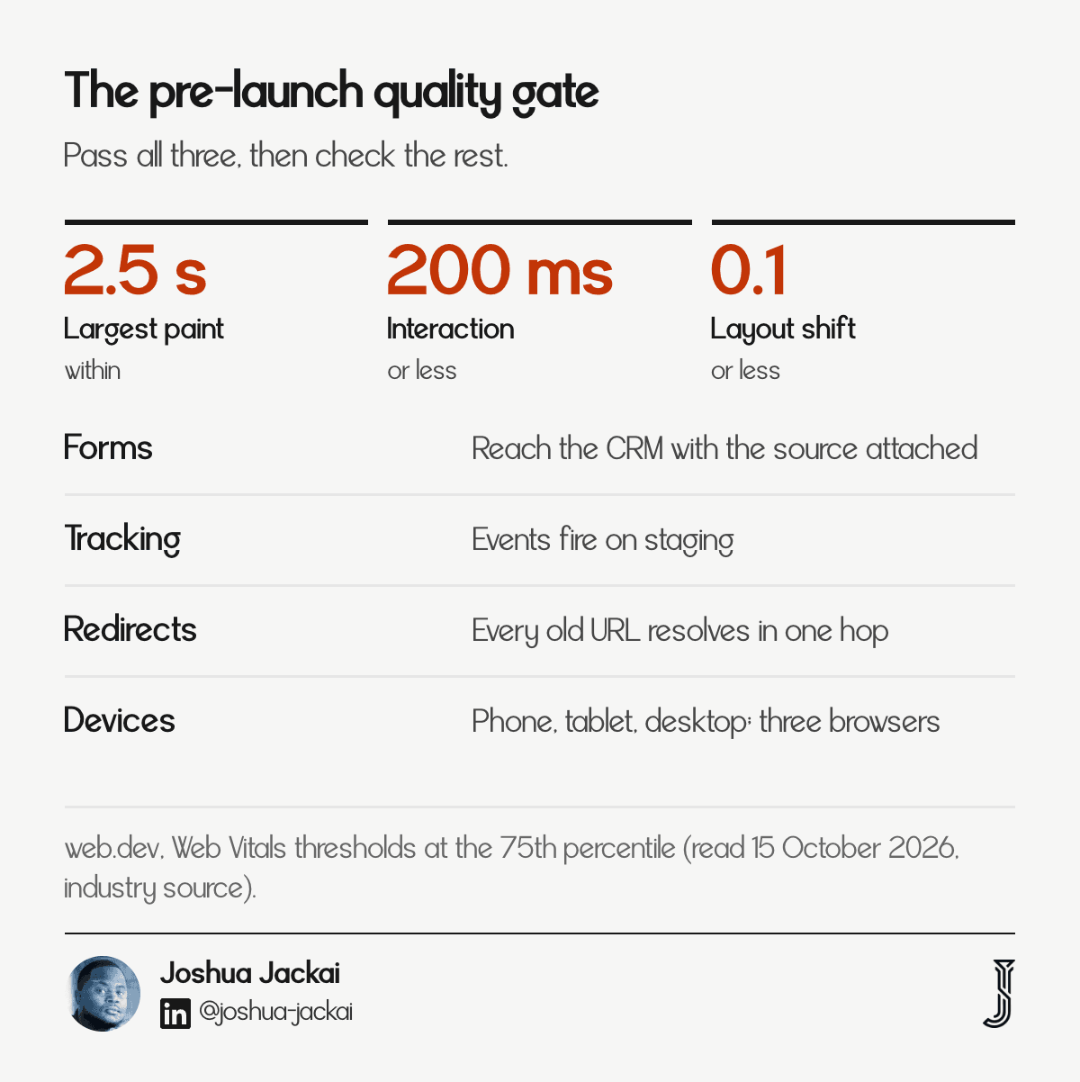
The build turns approved templates into a responsive site: content goes in, forms and integrations are wired, and analytics is configured before launch. Quality checks use fixed targets. Google’s Core Web Vitals call for a largest paint within 2.5 seconds, interaction responses within 200 milliseconds and layout shift of 0.1 or less, measured at the 75th percentile (web.dev).
Input: Approved designs, final copy and assets, and the redirect map
Output: A staging site that passes the quality gate
Owner: Me for the build, you for copy and the staging review
Skipped when: Tracking is added after launch “when there is time”
I treat three items as non-negotiable before launch. Every form must reach the right inbox or CRM record, with the source captured. Analytics and conversion events must fire on staging. Every URL in the redirect map must resolve in one hop. SEO carries over here too: titles, headings, canonical tags, structured data and the sitemap. I also run the key templates on a mid-range phone over a throttled connection, because a fast laptop hides problems that real visitors meet. Accessibility is checked in the same pass: keyboard focus, contrast and form labels. Any failure goes back to the build list before launch is scheduled.
My own timeline for a fixed-scope build is short because the earlier steps are settled. Moving Snappy Kraken from Figma to HubSpot took 21 days, and the work contributed to a 30 percent rise in marketing qualified leads. On a platform change, the build follows the migration discipline in full.
“I do not call a build finished until a test form submission shows up in the CRM with its source attached,” stated Joshua Jackai, founder of Demand Designer.
7. Launch and measure: best for turning a new site into a result
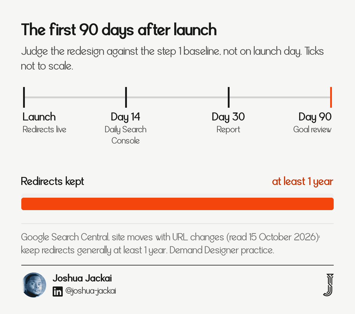
Launch puts the redirects live with the site, resubmits the sitemap and starts monitoring. Google advises keeping redirects “generally at least 1 year” (Google Search Central). I watch Search Console daily for the first two weeks, report at day 30, and review the goals from step 2 at day 90.
Input: Passing staging site, redirect map, Search Console and analytics access
Output: A live site, a day-30 report and a day-90 goal review
Owner: Me through the first fortnight, then a shared monthly review
Skipped when: The project is closed on launch day
Search results settle slowly, so I judge the redesign against the baseline from step 1 at day 90, not in week one. If a page lost visits, the cause is almost always a missing redirect, a changed title or a dropped heading, and the audit sheet shows which. For improvements after launch, controlled experiments are the standard method; Kohavi, Longbotham, Sommerfield and Henne wrote the survey most teams cite on running them on live websites (Data Mining and Knowledge Discovery, 2008).
For one US financial-advisor client, Advisor Websites, this sequence produced a 58 percent increase in organic traffic and a 28 percent increase in marketing qualified lead conversion. Post-launch support then covers the small tweaks that only appear once real traffic arrives, such as a form label that confuses people or a page that needs a clearer next step. Each change gets noted against the baseline so the results stay readable.
“Judge a redesign at day 90 against the baseline, not on launch day against a feeling,” stated Joshua Jackai, founder of Demand Designer.
What breaks when a redesign skips a step?
When a timeline is compressed, steps 1 to 3 disappear first, because they produce documents rather than screens. The result looks finished and performs like the old site, or worse. Each skipped step has a predictable failure, and most of them are visible in the numbers within 90 days.
Skipped audit: the new site drops pages that carried traffic, and no baseline exists to prove it.
Skipped goals: reviews turn into taste arguments and the project runs long.
Skipped URL map: old pages return errors and rankings fall.
Skipped wireframe test: layout problems are found after design budget is spent.
My timeline guide covers what is safe to compress, the cost guide shows what each level of process costs, and the website redesign guide shows how the whole decision fits together.
How I run these seven steps at Demand Designer
I run all seven steps myself on fixed-scope B2B website projects, so the person who audits the site is the person who builds it. If you want to see where your current site leaks leads before you commit to anything, the free Pipeline Leak Scorecard walks through the same baseline questions as step 1.
Frequently asked questions
What are the 7 steps in a website redesign?
Audit the current site, set measurable goals, plan the structure and URL map, wireframe and test, design the templates, build and quality-check, then launch and measure for 90 days. The first three steps happen before any visual design, and they decide most of what the new site can achieve.
How do I redesign an existing website without losing traffic?
Record a baseline first, then map every old URL to a new one, keep the pages that earn traffic, and launch with working redirects. Google advises keeping redirects for at least one year, and results can take weeks to settle, so compare against your baseline at day 90.
Do I need wireframes before design?
Yes for any site with more than a few pages. Wireframes let you test order and calls to action cheaply. Four or five participants find about 80 percent of usability problems, and sketched layouts test as well as finished ones, so you catch layout problems before design money is spent.
Can ChatGPT or another AI tool redesign my website?
AI tools can sketch layouts and draft copy quickly, but they cannot see your audit baseline, goals or redirect map. I use them for ideas in steps 4 and 5. Steps 1 to 3 need your real data, and a person has to be accountable for the result.
How involved do I need to be?
Heavily in steps 1 to 3, lightly after that. You provide analytics access, the goal decisions and one named approver, then consolidated feedback in the agreed turnaround. Front-loading your time is what keeps the later steps fast and keeps revision rounds to two.
Sources
Peer reviewed
Industry, agency and first-party
Google Search Central: site moves with URL changes (read 15 October 2026, industry source)
web.dev: Web Vitals thresholds (read 15 October 2026, industry source)
lowcode.agency: steps to redesign a website (September 2026, agency source, not peer reviewed)
Demand Designer client work: Snappy Kraken (Figma to HubSpot in 21 days, contributed to a 30 percent rise in marketing qualified leads) and Advisor Websites (58 percent organic traffic increase, 28 percent marketing qualified lead conversion increase). First-party results, not peer reviewed.
Free workbook
Pipeline Leak Scorecard
Find the leaks between your traffic and your pipeline. Score your site in about fifteen minutes, with it open in front of you.
12 questions, 8 pages, 15 minutes. Free.


