Web Design
7 Best B2B Website Examples Checked: 2026 Field Guide

Joshua Jackai
16 min

By Joshua Jackai, founder of Demand Designer · Published 14 October 2026 · Last updated and fact-checked October 2026
Demand Designer is a fixed-price, conversion-focused B2B web design studio for US companies, run by Joshua Jackai, who designs and rebuilds B2B websites.
Short answer: Slack, HubSpot, Stripe, Gong, Asana, McMaster-Carr and Uline each give the first screen one job. In this sample, read on 14 October 2026, five list Pricing in the top navigation and all seven show a demo, sales link or phone number. People judge visual appeal in about 50 milliseconds (Lindgaard and colleagues, 2006), so copy the job, not the look.
The long lists of best B2B website examples I found come from agencies and vendors, show screenshots and say a page "feels clean". I did something narrower. I opened seven real US B2B homepages, wrote down what each one says and offers in its first screen, and set each observation beside peer-reviewed research. If you run marketing at a US B2B company and you are collecting examples before a redesign, this guide shows what to copy and what to check first.
Key takeaways
Slack opens with one sentence, All your people and AI agents working together, and two buttons, and people form a view of a page's appeal in about 50 milliseconds (Lindgaard and colleagues, 2006).
Five of the seven pages (Slack, HubSpot, Stripe, Gong and Asana) list Pricing in the top navigation; McMaster-Carr and Uline lead with a catalog and a phone number instead.
Stripe shows US$1.9tn in payments processed in 2025 and 99.999% historical uptime, numbers that answer a payments buyer's main fear (Stripe homepage).
Asana's "85% of Fortune 100" figure carries a footnote dated December 2023, about 34 months before I read it (Asana homepage).
A meta-analysis of 63 conditions found a mean choice-overload effect of virtually zero, so two buttons are not automatically a mistake (Scheibehenne, Greifeneder and Todd, 2010).
# | Example | What the first screen does | Key number | Source type |
|---|---|---|---|---|
1 | Slack | One-sentence headline, two buttons, Pricing in the navigation | 97 minutes saved a week, Slack's claim | Vendor homepage |
2 | HubSpot | Two buttons for two kinds of buyer | 306,000+ customers worldwide | Vendor homepage |
3 | Stripe | Reliability numbers under the headline | US$1.9tn processed in 2025 | Vendor homepage |
4 | Gong | A named customer with three results | Anthropic: 64% productivity, 46% shorter ramp | Vendor homepage |
5 | Asana | A dated footnote on a proof number | 85% of Fortune 100, as of December 2023 | Vendor homepage |
6 | McMaster-Carr | Catalog first, no hero headline | 98% of products ordered ship from stock | Vendor homepage |
7 | Uline | Quick Order and a phone number | Order by 6 pm for same day shipping | Vendor homepage |
1. Slack: best for a first screen that explains itself in one sentence
Slack's homepage opens with one sentence, "All your people and AI agents working together," and one supporting line. Two buttons, Get started and Find your plan, sit beside them, and Pricing is in the top navigation. I read it on 14 October 2026. It suits any B2B team that sells a product people can try.
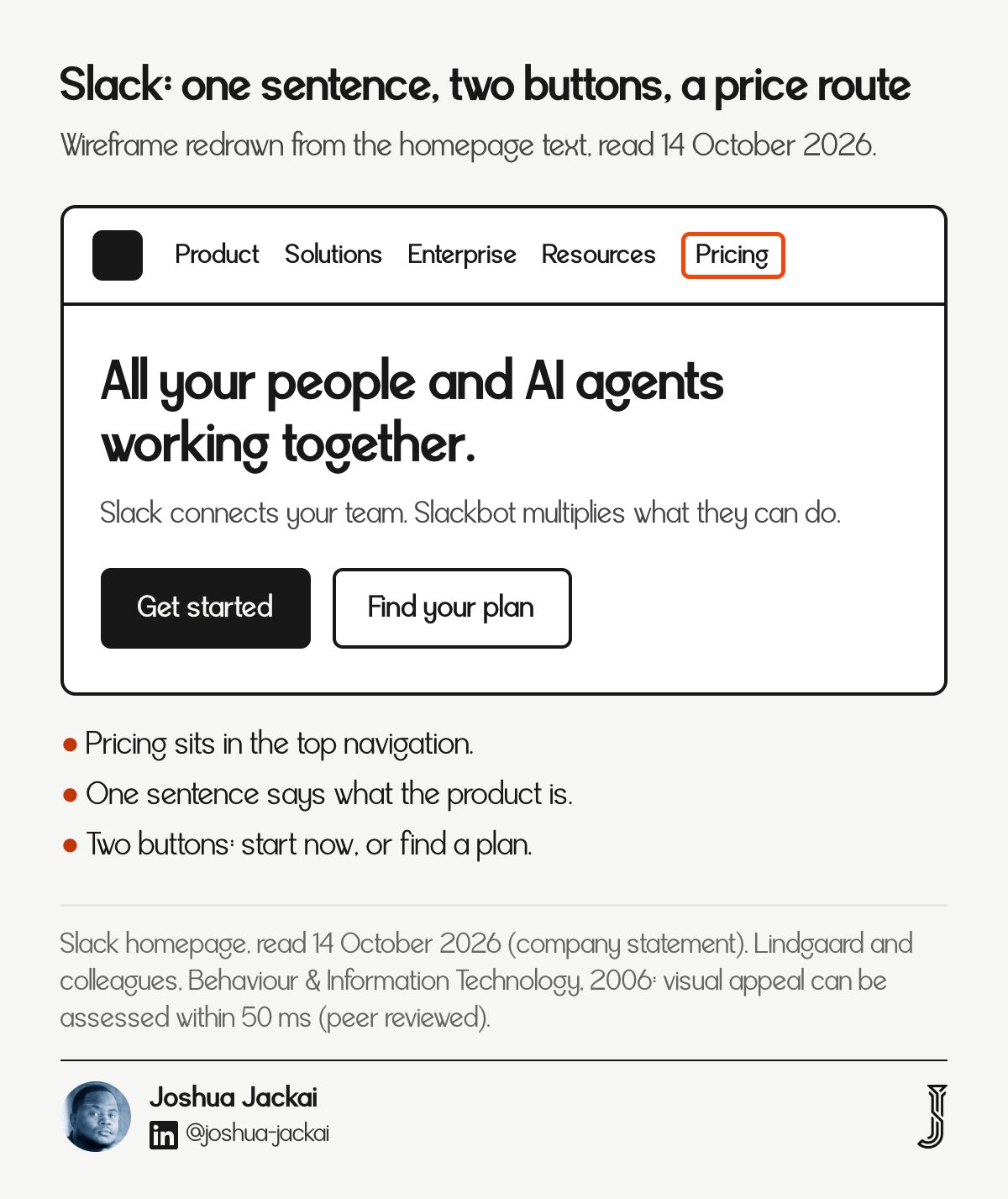
Headline: "All your people and AI agents working together."
Supporting line: "Slack connects your team. Slackbot multiplies what they can do."
First-screen buttons: Get started and Find your plan
Top navigation: Product, Solutions, Enterprise, Resources, Pricing
Number shown: 97 minutes, given as the average time users can save each week with AI in Slack
Slack is a clean example of a first screen doing one job. A visitor learns what the company offers, what to click and where the price lives, and nothing competes with that. The research gives a reason to care. Lindgaard and colleagues ran three studies on how quickly people judge a homepage and found that appeal can be rated after 50 milliseconds of viewing, which means the layout and the headline have to carry the first impression before anyone reads a sentence. A later study by Reinecke and colleagues collected ratings of 450 websites from 548 volunteers and built models that predict first impressions from visual complexity and colorfulness.
"Visual appeal can be assessed within 50 ms, suggesting that web designers have about 50 ms to make a good first impression," Lindgaard and colleagues wrote (Behaviour & Information Technology, 2006).
"Users make lasting judgments about a website's appeal within a split second of seeing it for the first time," Reinecke and colleagues wrote (CHI 2013).
Two cautions. The 97-minute figure is Slack's own claim (Slack homepage) and I did not trace its method. And "Request a demo" sits in the header, not in the hero, so a buyer who wants a person has to look for it. What to copy: one sentence, two next steps, pricing in view. What to leave: the AI vocabulary, which only works if your product does that.
2. HubSpot: best for two kinds of buyer on one page
HubSpot's first screen offers two buttons for two buyers: Get a demo for teams ready to talk to sales, and Get started free for teams that want to try the free tools first. A line beneath them reads "306,000+ customers worldwide." Pricing is a top-level navigation item.

Headline: "Build demand, win deals, and delight customers"
First-screen buttons: Get a demo, and Get started free
Top navigation: Products, Solutions, Pricing, Resources, About
Utility bar: Customer Support, Contact Sales, Log in
Number shown: 306,000+ customers worldwide, as HubSpot states it
The usual advice is to give a page one call to action. HubSpot breaks that on purpose, and the research says the usual advice is weaker than it sounds. Scheibehenne and colleagues pooled 63 conditions from 50 experiments with 5,036 participants and reported that the average effect of having too many options was virtually zero, with large differences between studies. So the research does not support a blanket one-button rule, although it covers choice among options in general, not two buttons on a homepage. What matters is whether the second option is a different answer for a different person.
"We found a mean effect size of virtually zero but considerable variance between studies," Scheibehenne, Greifeneder and Todd wrote (Journal of Consumer Research, 2010).
HubSpot states 306,000+ customers beside the buttons (HubSpot homepage). I found no study that tests a demo button against a free-trial button on a B2B homepage, so treat HubSpot's choice as a working design, not a proven one. The logic is easy to follow. Two buttons are two answers to two buyers, not two competing asks.
"Two buttons are two answers to two buyers, not two competing asks," wrote Joshua Jackai, founder of Demand Designer.
A service business can borrow the shape: one button to book a call and one to take a free self-check, so a buyer who is not ready to talk still has somewhere to go.
3. Stripe: best for proof that matches the size of the risk
Stripe's headline is "Financial infrastructure to grow your revenue." Under it the page lists 135+ currencies and payment methods, US$1.9tn in payments processed in 2025 and 99.999% historical uptime. In my reading, a buyer who moves money worries about reliability, and Stripe answers that worry with numbers instead of adjectives.

Headline: "Financial infrastructure to grow your revenue."
First-screen buttons: Get started, Sign up with Google, and Contact sales in the header
Top navigation: Products, Solutions, Developers, Resources, Pricing
Numbers shown: 135+ currencies and payment methods; US$1.9tn processed in 2025; 99.999% historical uptime; 200M+ active subscriptions on Stripe Billing
Limit: customer logos are images, and the names appear only in link addresses in the page text I read
The useful lesson is about matching proof to fear. For a payments product the fear is downtime and lost transactions, so the proof is volume and uptime. For a service business the fear is a missed deadline or a project that drifts, so the proof is delivery dates and kept scope. Gefen, Karahanna and Straub studied experienced repeat online shoppers and found that trust mattered as much as perceived usefulness and ease of use in whether people intended to buy. Their sample bought consumer goods, not B2B software, so I read it as direction, not as a B2B measurement.
"Consumer trust is as important to online commerce as the widely accepted TAM use-antecedents, perceived usefulness and perceived ease of use," Gefen, Karahanna and Straub wrote (MIS Quarterly, 2003).
Every Stripe number is first-party, and I did not audit any of them or check how the company measures historical uptime. The US$1.9tn figure is for 2025 as the company states it (Stripe homepage). If you show logos, name the companies in text nearby too, so every reader can see who they are.
4. Gong: best for naming the customer and the result
Gong's homepage says "Trusted by 5,000+ customers" and then shows a named customer story. Anthropic is credited with a 64% gain in revenue-team productivity, 10 hours saved per seller each week and a 46% drop in ramp time. A named customer with three numbers beats an unnamed logo strip.

Headline: "#1 AI OS for Revenue Teams"
First-screen buttons: Book a demo, See Gong in action, Watch on demand, Sign in
Top navigation: Product, Solutions, Innovation, Raving fans, Resources, Company, Pricing
Proof shown: Anthropic story, with 64%, 10 hours a week and 46% as Gong publishes them
Caveat: the page text I read gave no source for "#1"
Fogg and colleagues asked more than 1,400 people to rate 51 website elements for credibility. The five kinds of element that raised credibility were real-world feel, ease of use, expertise, trustworthiness and tailoring. A named customer with a specific result is one way a B2B page can show a real organization and some expertise at once. That mapping is my reading, not a finding of the study, and the study is from 2001 and was not about B2B. Still, the practical rule holds up: a result with a name and a number is easier to believe than a claim with neither.
"The data showed which elements boost and which elements hurt perceptions of Web credibility," Fogg and colleagues wrote (CHI 2001).
Gong states 5,000+ customers on the same screen (Gong homepage). The weak spot on this page is the headline. "#1" is a ranking, and a ranking with no stated source invites a skeptical buyer to discount the rest. A sourced ranking would be easier to check than the bare claim.
5. Asana: best for checking the date on a proof number
Asana's homepage says "85% of Fortune 100 companies choose Asana." The footnote reads "Accurate as of December 2023, includes free and paid users." I read the page on 14 October 2026, about 34 months later. Proof ages, and a dated footnote is honest but visible.
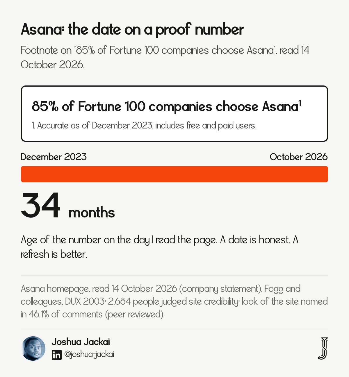
Headline: "The OS for human-agent teams"
Top navigation: Products, Solutions, Learning & support, Pricing
Sales route: Contact sales in the header
Number shown: 85% of Fortune 100, footnoted as accurate as of December 2023
Age of the number when read: about 34 months
I am not saying Asana's number is wrong. The figure may still hold, and putting a date on it is better than leaving it undated. The point is what a buyer sees: a first-screen statistic whose small print says it is nearly three years old. Fogg and colleagues analysed comments from 2,684 people judging the credibility of live websites. The look of the site came up most often, in 46.1% of comments, followed by information structure and focus. Small print is part of what a careful buyer reads, and this footnote adds that the figure counts free and paid users, which widens who counts as a company that chooses Asana.
The look of the site was "mentioned most frequently, being present in 46.1% of the comments," Fogg and colleagues reported (DUX 2003).
I found no peer-reviewed study that tests dated statistics on B2B pages, so the advice that follows is practical, not proven. Put a date on every number you show on a first screen. Then put a quarterly reminder in your calendar to re-check each one, and replace any number you cannot refresh.
6. McMaster-Carr: best for buyers who already know the part
McMaster-Carr has no hero headline. Its first screen has a Browse Catalog button, a category list, a Search control and a line saying 98% of products ordered ship from stock and deliver same or next day. The buyer arrives with a part in mind, so the page gets out of the way.

Entry points: Browse Catalog, a category list and Search
Promise: "98% of products ordered ship from stock and deliver same or next day"
Account links: Order and Order History
Phone: (630) 833-0300, with sales@mcmaster.com for email
What is missing: a persuasion headline and a Pricing link in the navigation
This is the opposite design from Slack, and it works for a different reason. Pirolli and Card described information foraging, in which people follow cues called information scent toward the content they want, and a category label is a strong cue for someone who knows what they need. McMaster-Carr spends the first screen on those cues and on a delivery promise, because its visitor is not comparing vendors. They are likely replacing one.
The lesson is to pick a first screen by how the buyer arrives. A buyer who knows the product needs a path to it. A buyer who is comparing vendors needs a reason to choose you. Most service businesses have the second kind of buyer, which is why copying McMaster-Carr's layout would hurt them while copying its honesty about who is visiting would help. I read the homepage as a signed-out visitor and did not test the search, so I cannot say how well it works. See the 98% line on the page for the exact wording.
7. Uline: best for ordering without browsing
Uline's top navigation includes Quick Order, with a sub-link to order by model number, and the first screen promises same-day shipping for orders placed by 6 pm. A banner says over 1,700 box sizes are in stock, and the phone number, 1-800-295-5510, is in view. Repeat buyers can skip the catalog.

Top navigation: Products, Uline Brand, Quick Order, Catalog Request, Special Offers, About Us, Careers
Shortcut: Quick Order, with "Order By Model Number" as a sub-link
Promise: "Order by 6 pm for same day shipping"
Stock claim: "Over 1,700 box sizes in stock" on the corrugated box banner
Phone: 1-800-295-5510, plus a Search bar and a Catalog Request link
Uline shows two kinds of buyer on one page and serves each of them. The repeat buyer gets Quick Order and the model-number path. The buyer who is still looking gets the category navigation and a printed catalog by request. Gefen, Karahanna and Straub found perceived ease of use mattered to consumers' intent to buy online. They did not study B2B ordering, so I read that as direction only.
"Repeat buyers can skip the catalog," wrote Joshua Jackai, founder of Demand Designer.
I cannot see Uline's order data, so I cannot say whether the Quick Order link raises orders. What I can say is that it shortens the task for the buyer who already knows the model number, which is one of the easier changes a team can copy. The cost is a navigation label and a form. The same page also offers a printed catalog on request, so a buyer who is not ready to order online still has a path forward. See the Uline homepage for the current wording, which may change.
How do the seven first screens compare?
The comparison table sets all seven first screens side by side on four facts I could read: the headline or entry point, whether Pricing is in the top navigation, what route to a person is visible and which number each page shows. Five pages list Pricing. All seven show a route to a person.
Example | Headline or entry | Pricing in top navigation | Route to a person | Number shown |
|---|---|---|---|---|
Slack | "All your people and AI agents working together." | Yes | Request a demo in the header | 97 minutes a week, Slack's claim |
HubSpot | "Build demand, win deals, and delight customers" | Yes | Get a demo, Contact Sales | 306,000+ customers |
Stripe | "Financial infrastructure to grow your revenue." | Yes | Contact sales | US$1.9tn processed in 2025 |
Gong | "#1 AI OS for Revenue Teams" | Yes | Book a demo | 5,000+ customers; Anthropic 64% |
Asana | "The OS for human-agent teams" | Yes | Contact sales | 85% of Fortune 100, December 2023 |
McMaster-Carr | Browse Catalog, no hero headline | No | Phone and email | 98% ship from stock |
Uline | Quick Order, no hero headline | No | Phone and Contact Us | Over 1,700 box sizes in stock |
The pattern splits by how the buyer arrives. The five software and payments pages sell to a buyer who is comparing, so they lead with a headline, a price route and proof. The two catalog pages sell to a buyer who is replacing something, so they lead with search, speed and a phone number. A service business almost always has the comparing buyer.
How do you check your own first screen in ten minutes?
Open your homepage on a phone, set a timer for ten minutes and answer six questions in order. Each one comes from a fact in these seven examples. Write the answers down, because a check you only think through gets skipped the next time you ship a change.
Headline: can a stranger say what you sell after one read? Slack does it in one sentence.
Next step: is there a button for each kind of buyer? HubSpot has two.
Price route: is Pricing, or a stated price range, in the top navigation? Five of the seven pages list it.
Proof: is there a named customer or a number a buyer can check? Gong names Anthropic with three results.
Date: does every number on the first screen carry a date, and is the date recent? Asana footnotes December 2023.
Person: can a buyer reach a human in one click? All seven pages show a route.
Score one point for each yes. If you answer no to two or more, start with the first no.
How I picked and read these seven
I picked seven US B2B homepages that differ in model: collaboration software, a CRM platform, payments, sales software, work management and two industrial catalogs. I opened each on 14 October 2026, wrote down what the first screen says and offers, and checked the key strings in the page source. These are not a ranking.
Search results for this topic turned up long lists from agencies and software vendors. I used them only to find names, never as evidence, because most are written by firms that sell the service. I replaced one planned example, Grainger, because its homepage returned an error page to my fetch, and a missing page is not something I can describe. A different visitor, a signed-in visitor or a different country can see a different first screen, and any of these pages may have changed since I read them. Every number on a homepage is the company's own claim. I did not measure conversion, traffic or sales for any of them, and the only research I cite on design comes from studies of consumers and general websites.
I wrote a separate guide on what makes a good B2B website, which covers the rules. This guide is about examples, so the two do not repeat each other.
Frequently asked questions
What is a good example of a B2B website?
Slack, HubSpot, Stripe, Gong and Asana are strong examples for software and payments because their first screens state what they sell, offer a next step and list Pricing in the navigation. For catalog sellers, McMaster-Carr and Uline lead with search, speed and a phone number instead.
Which is the best B2B website?
I found no public data that ranks B2B homepages by conversion, so no one can name a measured winner. Each of the seven here suits a different buyer. The best one for you matches how your buyers arrive: comparing vendors, or already knowing what they need.
What are the top 10 B2B websites in the USA?
I found no authoritative top 10. The ranking lists I saw measure traffic or company size, which says little about how well a page works. I read seven pages and describe what each does. Add your own competitors before you decide what to copy.
What should a B2B homepage show first?
Show what you sell in one sentence, a next step for each kind of buyer, a way to see pricing and one dated proof point. All seven pages do some version of this, and the two catalog sites swap the headline for search and a phone number.
How I build a first screen that passes the check
I quote fixed prices and write the first-screen job into the scope before design starts. In my own client work, Snappy Kraken, a marketing platform for financial advisors, moved its site from Figma to HubSpot in 21 days, and the work contributed to a 30 percent rise in marketing qualified leads.
For Advisor Websites, a website provider for financial advisors, my work contributed to a 58 percent rise in organic traffic. Those are my own reported figures with no published baseline or window, so apply the same discount I suggest for every proof number on a first screen. If you want your current site scored before anyone quotes you a redesign, start with the Pipeline Leak Scorecard. It takes about 15 minutes with your site open, and it scores your site on twelve questions.
Sources
Peer reviewed
Lindgaard, G., Fernandes, G., Dudek, C. and Brown, J. (2006). Attention web designers: You have 50 milliseconds to make a good first impression! Behaviour & Information Technology, 25(2), 115-126. doi:10.1080/01449290500330448
Reinecke, K., Yeh, T., Miratrix, L., Mardiko, R., Zhao, Y. and Liu, J. (2013). Predicting users' first impressions of website aesthetics with a quantification of perceived visual complexity and colorfulness. Proceedings of the SIGCHI Conference on Human Factors in Computing Systems, 2049-2058. doi:10.1145/2470654.2481281
Scheibehenne, B., Greifeneder, R. and Todd, P. M. (2010). Can There Ever Be Too Many Options? A Meta-Analytic Review of Choice Overload. Journal of Consumer Research, 37(3), 409-425. doi:10.1086/651235
Gefen, D., Karahanna, E. and Straub, D. W. (2003). Trust and TAM in Online Shopping: An Integrated Model. MIS Quarterly, 27(1), 51-90. doi:10.2307/30036519
Fogg, B. J., Marshall, J., Laraki, O., Osipovich, A., Varma, C. and Fang, N. (2001). What makes Web sites credible? Proceedings of the SIGCHI Conference on Human Factors in Computing Systems, 61-68. doi:10.1145/365024.365037
Fogg, B. J., Soohoo, C., Danielson, D. R., Marable, L., Stanford, J. and Tauber, E. R. (2003). How do users evaluate the credibility of Web sites? Proceedings of the 2003 Conference on Designing for User Experiences, 1-15. doi:10.1145/997078.997097
Pirolli, P. and Card, S. (1999). Information foraging. Psychological Review, 106(4), 643-675. doi:10.1037/0033-295X.106.4.643
Homepages read, 14 October 2026 (company statements, not independently verified)
Slack: https://slack.com/
HubSpot: https://www.hubspot.com/
Stripe: https://stripe.com/
Gong: https://www.gong.io/
Asana: https://asana.com/
McMaster-Carr: https://www.mcmaster.com/
Uline: https://www.uline.com/
If you want your first screen checked against these six questions before a redesign is quoted, book a free 15-minute call. I will tell you which fix to make first.
Free workbook
Pipeline Leak Scorecard
Find the leaks between your traffic and your pipeline. Score your site in about fifteen minutes, with it open in front of you.
12 questions, 8 pages, 15 minutes. Free.


