Web Design

Joshua Jackai
19 min

By Joshua Jackai, founder of Demand Designer, a studio that designs and builds B2B websites on Framer, HubSpot and WordPress. Published 6 October 2026, last updated 6 October 2026. Every DOI in this article was checked against the Crossref record on 6 October 2026.
A good B2B website in 2026 does one job. It moves a buyer who already has a problem from a search result or a referral to a conversation with your sales team. It does that on a phone, in a few seconds, without making anyone guess what you sell.
The rest of this article tests that sentence against the research. Almost everything written about what makes a good website is a list of adjectives with no evidence attached. Clean. Modern. Engaging. User-friendly. Those words describe the writer's taste, not a result. When a head of marketing asks me what a good website looks like, I want to be clear about where each part of the answer comes from. Some parts are measured findings from controlled studies. Some are textbook frameworks worth knowing. Some are my own judgement from building these sites. I have labelled all three throughout. Sentences that begin "in my projects" or "my view" are judgement. The "Sources" section at the end separates peer-reviewed research from textbooks, legal texts and industry material.
The questions below are the ones people type into Google around this topic, and each section answers one of them on its own. The lists overlap on purpose, because they come from different traditions: my own checklist, a 2002 design textbook, a 1987 interface textbook and a 2001 e-commerce textbook.

Illustrative photo.
What makes a good B2B website in 2026?
A good B2B website in 2026 is fast, understood within seconds, trusted on sight, and built around one next step for the buyer. Every other quality people list is a way of achieving one of those four.
Here is how I arrived at the four qualities of a good B2B website, and why the order matters.
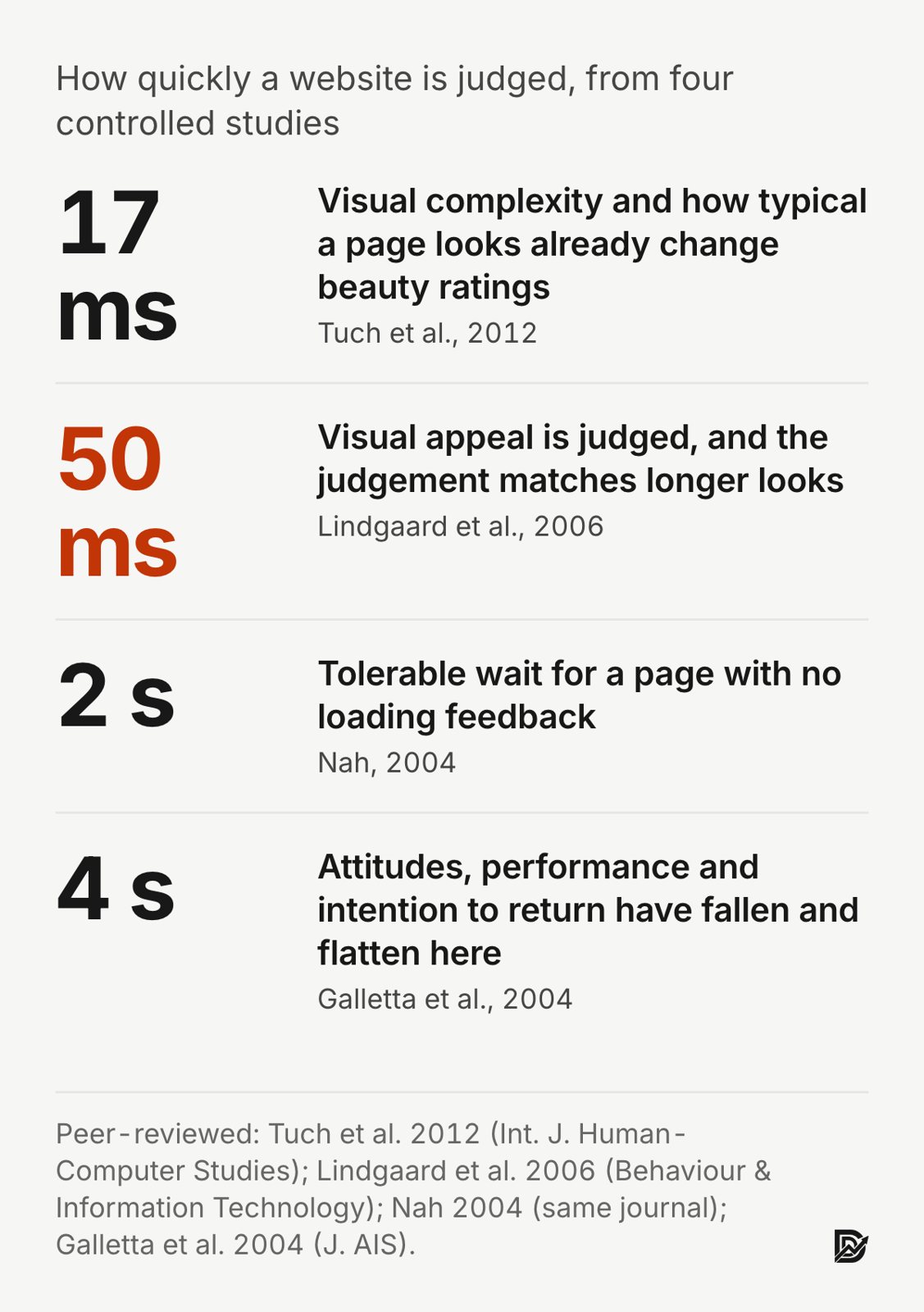
Understood within seconds. Visitors form a judgement of a page before they read it. In a set of experiments published in Behaviour and Information Technology, Gitte Lindgaard and colleagues showed web pages for 50 milliseconds. The visual appeal ratings people gave at that exposure matched the ratings given after longer looks. The paper's title is the finding: "Attention web designers: You have 50 milliseconds to make a good first impression!" (Lindgaard et al., 2006, doi:10.1080/01449290500330448). A later study at the University of Basel found that pages with low visual complexity and high prototypicality were rated as more beautiful. Prototypicality means the page looks the way a visitor expects a page of that kind to look. The effect held even at exposures of 17 milliseconds (Tuch et al., 2012, doi:10.1016/j.ijhcs.2012.06.003). For a B2B website that means the first screen has to say what you do, for whom, in plain words. It also has to look like a company website rather than an experiment.
Fast. Fiona Nah studied tolerable waiting time. Without any feedback that a page is loading, people were willing to wait only about two seconds before they started to give up (Nah, 2004, doi:10.1080/01449290410001669914). Dennis Galletta's team ran a controlled experiment with 196 participants and fixed delays of 0, 2, 4, 6, 8, 10 and 12 seconds. Task performance, attitudes toward the site and the intention to return all fell as delay grew. The drop in performance and intentions began to flatten once delays reached four seconds or more. Attitudes flattened from eight seconds (Galletta et al., 2004, doi:10.17705/1jais.00044). Both speed studies are from 2004, when connections and expectations were different. I use them for the direction of the effect, not the exact seconds. The seconds I build to are Google's thresholds in the five elements section. Speed is not a technical nicety. It decides whether the first screen is ever seen.
Trusted on sight. Trust on a website is built by the design and the content before anyone reads a testimonial. Carlos Flavián and colleagues surveyed website users and found that perceived usability raised both satisfaction and trust, and that trust in turn drove loyalty to the site (Flavián, Guinalíu and Gurrea, 2006, doi:10.1016/j.im.2005.01.002). Dianne Cyr studied website users in Canada, Germany and China. Information design, navigation design and visual design each fed trust and satisfaction, which fed the intention to come back (Cyr, 2008, doi:10.2753/mis0742-1222240402). B.J. Fogg's Stanford study asked 2,684 people to explain why they found a site credible or not. The most common type of comment, at 46.1 percent, was about the design look of the site, ahead of comments about the information itself (Fogg et al., 2003, doi:10.1145/997078.997097). That study is from 2003, so I read it as evidence that design carries credibility, not as a current percentage. Named clients and measured results placed beside each claim are my own practice on B2B websites, not a finding from these studies.
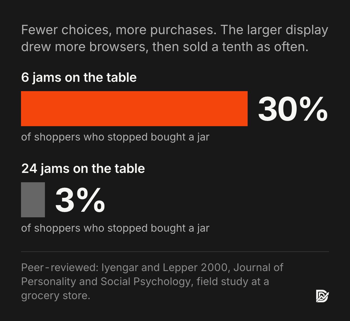
One next step. William Hick's 1952 experiments established that the time it takes to choose grows with the logarithm of the number of options (Hick, 1952, doi:10.1080/17470215208416600). Hick measured reaction time to stimuli, so applying his law to buttons on a page is an inference. Sheena Iyengar and Mark Lepper's field study at a grocery store is the more familiar evidence. A tasting table with 24 jams attracted more browsers than a table with six. The six-jam table then produced ten times the share of purchases: about 30 percent of people who stopped bought a jar, against about 3 percent at the larger display (Iyengar and Lepper, 2000, doi:10.1037/0022-3514.79.6.995). A later meta-analysis of choice-overload studies found the average effect close to zero and strongly dependent on conditions (Scheibehenne, Greifeneder and Todd, 2010, doi:10.1086/651235). I treat these results as a reason to test fewer calls to action, not as proof that five buttons cost you leads.
Everything else, from navigation to typography to the blog, is in service of those four. My own first test for a B2B website is to load it on a phone over a mobile connection. I time how long it takes before I could repeat what the company does and what it wants me to do next. On the Snappy Kraken homepage I built in HubSpot, the first screen names the audience (financial advisors), the outcome and a single request-a-demo action. In the reporting the team shared with me, that build contributed to a 30 percent rise in marketing qualified leads. I cannot separate the design from the other changes the team made at the same time, so I treat it as evidence of direction rather than proof of cause.
Consistency is the fifth quality, and I count it separately from the four because it is a property of the whole site rather than of a single page. It is covered under the five elements.
How is a good B2B website different from a consumer website?
A good B2B website differs from a consumer website in who decides, how long they take and what they need: a buying group, not one shopper; weeks, not minutes; and information, proof and a hand-off to sales, not a checkout.
Most website research studies consumers, so this is the question where I lean hardest on the little B2B evidence there is and on my own projects. Chakraborty, Lala and Warren surveyed 540 business customers of a power tool company about the construction-industry websites they knew best. Of eight candidate factors, four predicted how effective the customers judged a B2B website to be: informativeness, organisation, transaction-related interactivity and personalisation. Four others showed no direct relationship with effectiveness in their data: entertainment, privacy and security features, accessibility features and interactivity that was not tied to a transaction (Chakraborty, Lala and Warren, 2002, doi:10.1002/dir.10044). The study is twenty years old and covers one industry, so I use it as a direction. The direction is clear: business buyers rated a B2B website on whether it told them what they needed to know, in an order they could follow, with a way to act. They did not rate it on being entertaining.
The rest of this section is my reading of the B2B buying process from my own projects, not research.
Several people decide, not one. A B2B website is read by the person with the problem, the person who signs, and often a technical or security reviewer. Each needs a different page: the problem page, the pricing or business-case page, the integration or security page. A consumer site can aim at one reader.
The consideration is long. B2B buyers come back over weeks. Meinald Thielsch and colleagues found that aesthetics dominated a site's first impression, while content dominated whether people intended to return and whether they recommended the site (Thielsch, Blotenberg and Jaron, 2013, doi:10.1093/iwc/iwt033). Their participants were general users, not business buyers. The pattern still fits a long B2B cycle: the first visit is won by design, the fifth by what the pages say.
Price and implementation questions come early. I publish price ranges on this site rather than "contact us" so that the website answers the question before a call. That is a choice, not a research finding, and the B2B website cost guide is where the ranges live.
Proof is read by segment. A financial technology buyer wants to see a financial technology result. A B2B website should let a buyer find the case study for their industry or role in one click, with the result in the first line. Snappy Kraken and Advisor Websites, two clients on this site's project pages, both serve financial advisors, so a buyer in that market can read both.
The conversion is a hand-off, not a checkout. The form, the booked call or the demo request has to land in a system where a named person acts on it within a working day. On a Y Scouts landing page I built in HubSpot, 938 visitors produced 166 form submissions, a 17.7 percent conversion rate. The form wrote straight into the record the recruiters worked from. I did not test it against a version that did not, so I cannot say how much of the rate that explains. It is my own project data, not research.

The real Y Scouts landing page, built in HubSpot by Demand Designer, shown in an illustrative scene.
Those five differences are also where B2B website best practices come from: one page per decision-maker, content that rewards a return visit, a visible price range, proof filed by segment, and a form that lands on someone's desk.
What makes a good website in 2026?
A good website in 2026 tells a stranger what it is for in one screen, loads quickly on a phone, works with assistive technology, and keeps real, quotable text in its HTML for search engines and AI answer engines.
The first screen and speed are shared with the B2B answer. Accessibility and machine-readable text are the pair that 2026 adds, and a B2B website needs all four plus trust on sight and one next step.
Google's AI Overviews, ChatGPT and Perplexity answer questions by summarising web pages, so they sit between a website and some of the people who would once have visited it. The best peer-reviewed evidence I know of on what gets a page cited by those engines is a 2024 paper presented at KDD, the ACM data mining conference. Pranjal Aggarwal and colleagues built a benchmark of 10,000 queries and tested nine ways of rewriting a page to earn more visibility in generated answers. Adding statistics, adding quotations from relevant sources and citing sources worked best. In the authors' words, "we demonstrate that GEO can boost visibility by up to 40% in generative engine responses," and they add that "the efficacy of these strategies varies across domains." Keyword stuffing did not help (Aggarwal et al., 2024, doi:10.1145/3637528.3671900). The 40 percent figure comes from the authors' benchmark of a research generative engine, so treat it as a direction rather than a forecast for any one platform. The practical version: a good website in 2026 has pages with specific numbers, named sources and real quotations.
Those numbers and quotations also have to be present in the HTML without JavaScript running. In December 2024, Vercel and MERJ analysed crawler traffic across sites on Vercel's network. The crawlers from OpenAI, Anthropic and several other AI companies fetched pages but did not execute JavaScript. Google's crawler, which also feeds Google's AI features, did render it (Vercel and MERJ, "The rise of the AI crawler", December 2024, vendor data, not peer reviewed). A page that paints its content in the browser is therefore invisible to several of the engines a B2B website would want to be quoted by. Server-rendering the text removes the question.
Accessibility has moved from a nicety toward a legal baseline in some markets. The European Accessibility Act, Directive (EU) 2019/882, has applied since 28 June 2025 to a defined list of mostly consumer-facing products and services, such as online shops, consumer banking and transport ticketing. It exempts microenterprises that provide services. A B2B marketing site is often outside its direct scope, so check your own position with counsel. The commercial case does not depend on the law. Sven Schmutz, Andreas Sonderegger and Jürgen Sauer at the University of Fribourg ran a controlled experiment. Nondisabled participants used versions of a site built to different levels of the Web Content Accessibility Guidelines. The more accessible versions produced faster task completion and higher satisfaction for those nondisabled users too (Schmutz, Sonderegger and Sauer, 2016, doi:10.1177/0018720816640962). The W3C's Web Accessibility Initiative puts the principle in one line from Tim Berners-Lee: "The power of the Web is in its universality. Access by everyone regardless of disability is an essential aspect."
One more finding shapes how I think about "good". In the Thielsch study, aesthetics won the first impression and content decided the return visit and the recommendation. A good website wins the first second with design and the next month with what it says.
What are the 5 elements to a good website design?
The five elements of good website design, in my working list for B2B websites, are a clear first screen, speed, trust on sight, one next step and consistency. Jesse James Garrett's textbook list is strategy, scope, structure, skeleton and surface.
Both lists are useful and they answer different questions. Garrett's five planes, from his 2002 book The Elements of User Experience (a textbook, not a peer-reviewed study), describe the order in which a website should be decided. Strategy is why the site exists and what users need. Scope is which features and content it will have. Structure is how the pieces relate, skeleton is where things sit on the page, and surface is what it looks like. My view is that most arguments inside a company about its website happen on the surface plane while the strategy plane was never written down. If a redesign brief does not state the business goal and the buyer's need in one paragraph each, the surface debates never end. My redesign playbook opens with exactly that brief for this reason.
My five elements are what I check on a finished B2B website page.
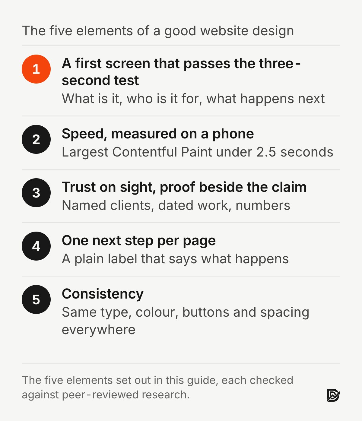
1. A first screen that passes the three-second test
The first element of a good website is a first screen that answers three questions without scrolling: who this is for, what they get, and what happens next. Lindgaard (2006) and Tuch (2012) found that people judge a page in 50 milliseconds or less, which is why this screen carries so much weight.
Katharina Reinecke and colleagues built a model that predicted people's first-impression aesthetic ratings of web pages from measurable properties, with colourfulness and visual complexity the strongest predictors (Reinecke et al., 2013, doi:10.1145/2470654.2481281). High complexity, meaning many elements, many colours and dense layouts, lowered the ratings. A first screen with one headline, one sentence, one image and one button is not minimalism for its own sake. It is the complexity level the research favours.
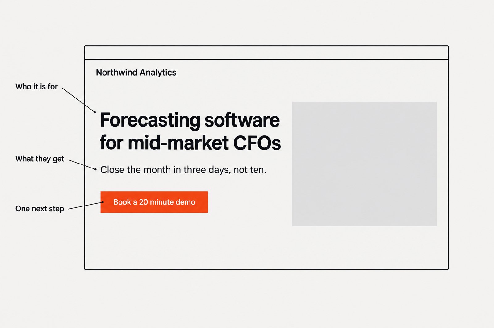
Illustration with example data.
2. Speed, measured on a phone
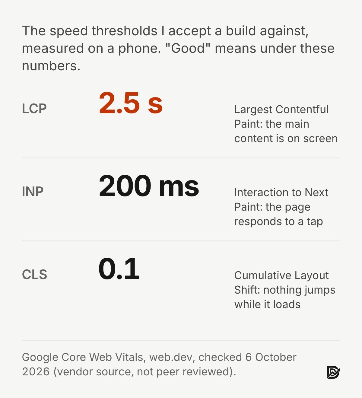
The second element is speed, measured on a phone over a mobile connection rather than on an office desktop. The thresholds I accept a build against are Google's Core Web Vitals (a vendor source, checked 6 October 2026). Largest Contentful Paint under 2.5 seconds. Interaction to Next Paint under 200 milliseconds. Cumulative Layout Shift under 0.1. Each is measured at the 75th percentile of page loads.
Those are Google's numbers, not research findings, but they sit inside the two to four second window the Nah and Galletta studies describe. Jonathan Palmer's study of corporate websites in Information Systems Research found five predictors of success: download delay, navigability, content, interactivity and responsiveness. Each predicted whether people used a site often, were satisfied with it and intended to return (Palmer, 2002, doi:10.1287/isre.13.2.151.88).
3. Trust on sight, with proof where the claim is made
The third element is a page that earns trust before anyone reads a testimonial, through care in its presentation. It then puts the named client and the result beside the claim they support, not on a separate testimonials page.
The care part is research. Andrea Everard and Dennis Galletta ran an online-store experiment. Presentation flaws such as errors, poor style and incompleteness lowered perceived quality, which lowered trust and the intention to buy (Everard and Galletta, 2005, doi:10.2753/mis0742-1222220303). I expect the same of a case study with a typo in it, though they did not test case studies. The proof-beside-the-claim part is my practice; I have written separately about how to build trust on a website.
4. One next step per page
The fourth element is one next step on each page, matched to how ready that page's reader is. A homepage visitor may want a demo. A pricing page visitor may want to talk. A blog reader may want a checklist.
Hick (1952) and Iyengar and Lepper (2000) are the evidence for fewer choices, with the Scheibehenne (2010) caveat that the choice-overload effect depends on conditions. The practical rule is that a page should never make a buyer compare its buttons.
5. Consistency
The fifth element is consistency: the same words for the same things, the same layout logic from page to page, the same colours meaning the same actions. Ozok and Salvendy (2000) measured consistency across web pages and found that it affected both how well people performed tasks and how satisfied they were (Ozok and Salvendy, 2000, doi:10.1080/001401300184332).
Shneiderman's first golden rule, "Strive for consistency", makes the same point from a different decade.
The afternoon test
All five elements can be checked this afternoon without a designer. Load the homepage on a phone over mobile data and time it. Hand the phone to someone outside the company and ask them what you sell. Count the calls to action on the homepage. Open the navigation, a service page and a case study and confirm the service has the same name in all three. Open the three most visited pages and look for a result or a named client next to each promise. Then, separately, ask sales how many of last quarter's opportunities first arrived through the website, because a good B2B website is in the end measured by that number.
If any check fails, that is the place to start, and in my experience it is usually one of the first two. The Pipeline Leak Scorecard walks through the same checks in twelve questions. The post on why B2B websites lose high-value clients covers what the failures look like from the buyer's side.
What are the five golden rules of a website?
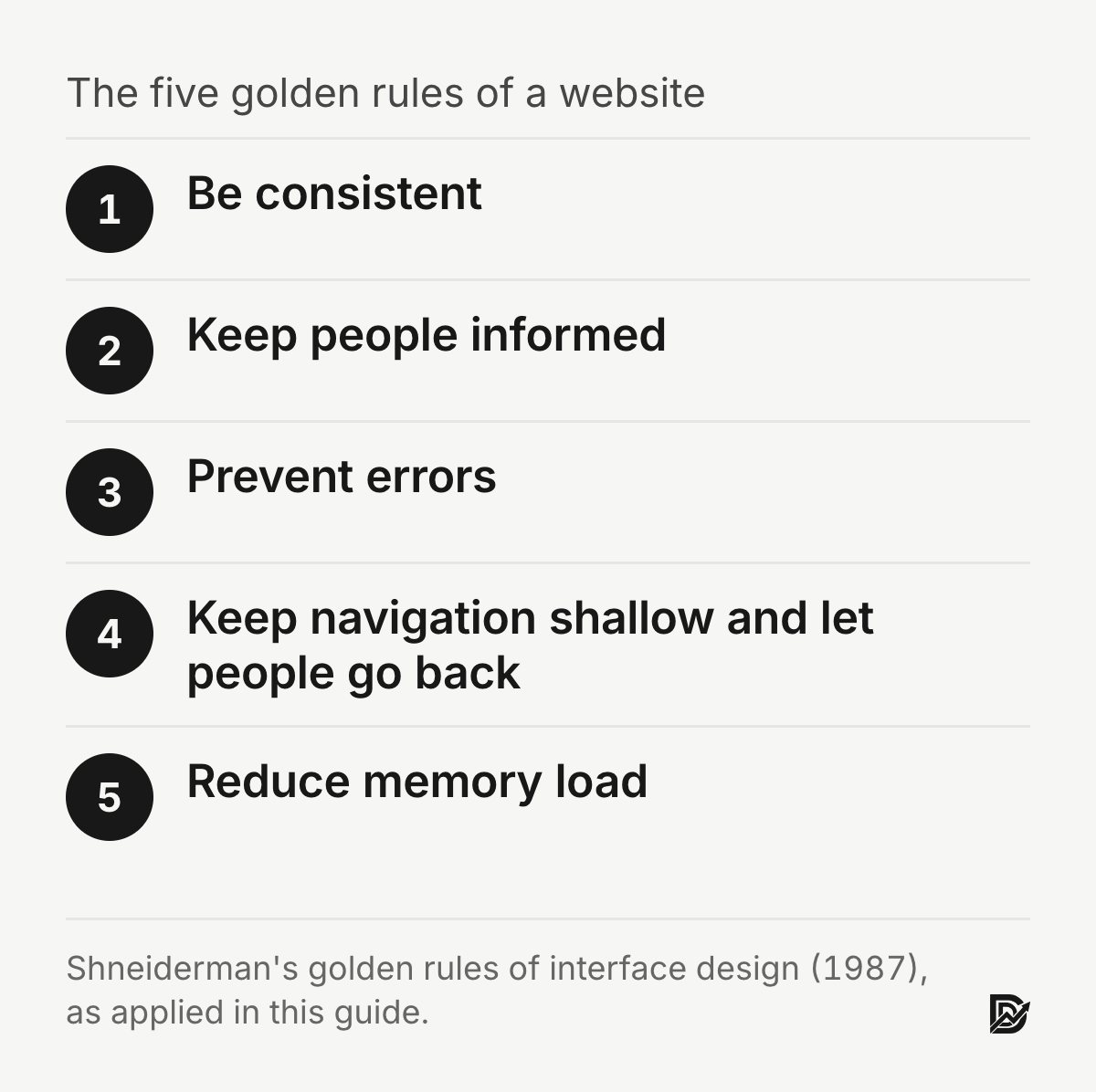
The five golden rules of a B2B website, in my version, are consistency, informative feedback, error prevention, shallow navigation with a way back, and low memory load. They narrow Ben Shneiderman's eight golden rules to what a marketing site needs.
No standard list of five golden rules exists; other sites publish different fives. Shneiderman's eight is the list with a textbook and decades of citation behind it, so I start there. The rules first appeared in his Designing the User Interface in 1987 (a textbook, not a peer-reviewed paper) and have survived every platform shift since. The eight are: strive for consistency; seek universal usability (originally "enable frequent users to use shortcuts"); offer informative feedback; design dialogs to yield closure; prevent errors; permit easy reversal of actions; keep users in control; and reduce short-term memory load. Shneiderman's first rule is three words long: "Strive for consistency." The applications that follow are mine. Apart from the studies named, they are my reading of the rules rather than tested results.
Rule 1: Be consistent
Navigation labels, button wording, colour meaning and page structure should not change between pages of a B2B website. Ozok and Salvendy (2000) found that inconsistency across web pages hurt both task performance and satisfaction. On my projects the most common inconsistency is a service called one thing in the navigation, another on the service page and a third in the case study.
Rule 2: Keep people informed
A form that shows nothing after you press submit, a page that loads blank for three seconds, a filter that changes results with no visible sign. Each leaves the visitor unsure whether anything happened. Nah's 2004 waiting-time study found that a loading indicator extended how long people were prepared to wait, which is the research version of "say what is happening".
Rule 3: Prevent errors
The error that matters most on a B2B website is the wrong path, not the wrong form field. A visitor who clicks "Pricing" and lands on a "Contact us for a quote" page has hit an error you designed. The fix is to label links by their real destination and to show at least a price range when a price exists.
Rule 4: Keep navigation shallow and let people go back
Kevin Larson and Mary Czerwinski compared ways of organising the same 512 items at Microsoft Research. Broad, shallow structures of two levels, with 16 and 32 items, were faster to search than a deep hierarchy of three levels with eight items each. People got lost in depth (Larson and Czerwinski, 1998, doi:10.1145/274644.274649). Their paper is about structure rather than undo, and the application to a marketing site is mine: fewer levels, clearer labels, and a visible path back from every page.
Rule 5: Reduce memory load
Do not make the buyer carry information between pages. If the pricing page needs the reader to remember which plan includes what from the features page, put the features on the pricing page. If a case study needs the reader to remember which service it illustrates, name the service in the first line. This is also the rule behind writing a short, complete answer at the top of each section, which is how this article is structured.
The rules that matter less on a marketing site are shortcuts and closure, which belong to software people use daily. Many B2B buyers arrive at a vendor website having never seen it before, and the people who return are often different people from the same company.
What are the 7 C's of a website?
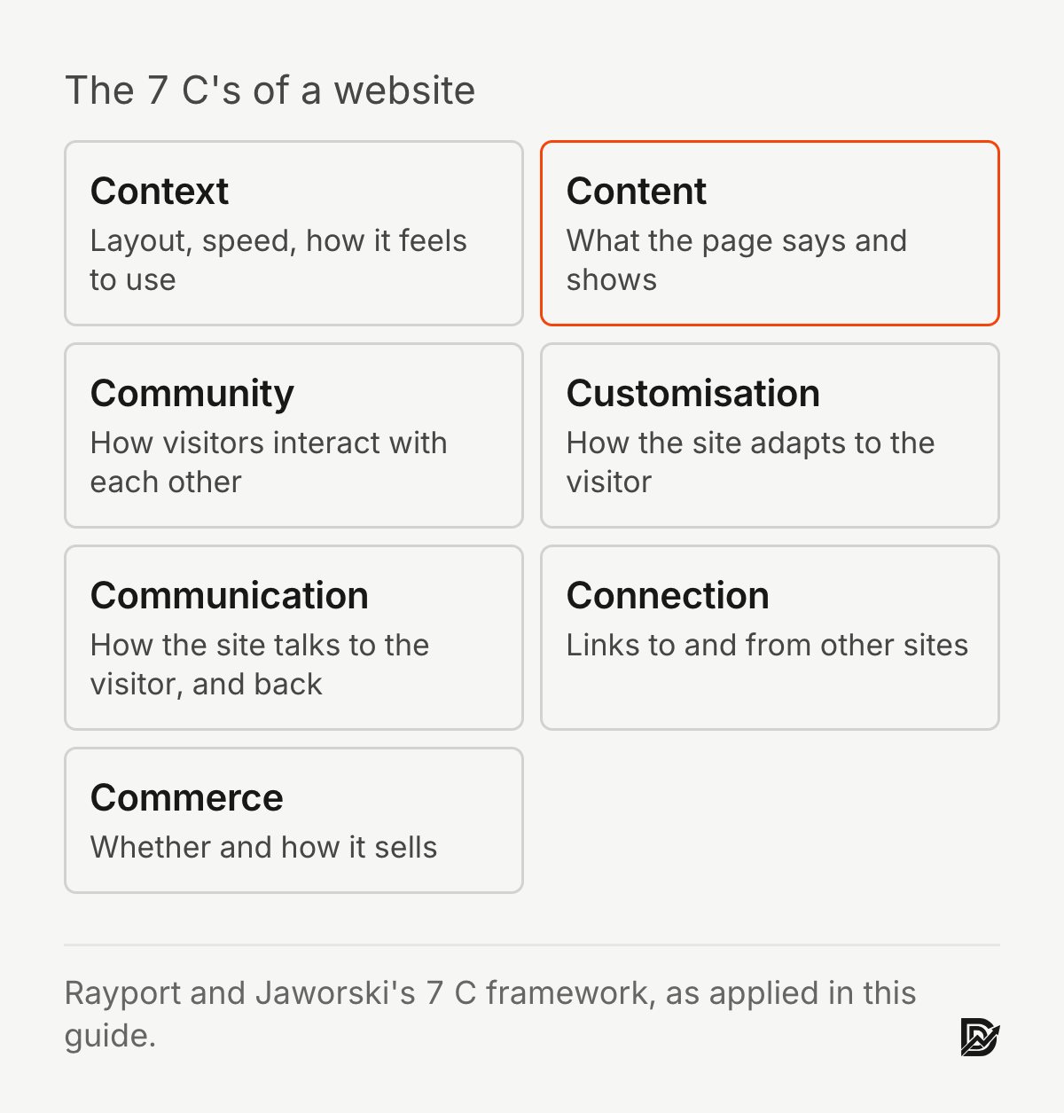
The 7 C's of a website are context, content, community, customisation, communication, connection and commerce. The framework comes from Jeffrey Rayport and Bernard Jaworski's e-commerce textbooks, and researchers have since used it in peer-reviewed work on customer interfaces.
Rayport and Jaworski introduced the 7 C's in Introduction to e-Commerce (2001, a textbook) as a way of describing everything a customer meets on a commercial website. Young Eun Lee and Izak Benbasat at the University of British Columbia took the framework into the research literature. They extended it for mobile commerce in Communications of the ACM, adding the constraints of small screens and mobile settings (Lee and Benbasat, 2003, doi:10.1145/953460.953487). That paper is one reason the 7 C's still turn up in design courses. It is also a reminder that the framework predates the phone-first web and needs translating.
Here is what each of the 7 C's means on a B2B website in 2026, in my reading.
Context
Context is the look and feel of a website: layout, type, colour, and how the site is organised. It is where first impressions happen, so the first-impression research of Lindgaard and Tuch applies. Morten Moshagen and Meinald Thielsch identified four facets of visual aesthetics in websites: simplicity, diversity, colourfulness and craftsmanship (Moshagen and Thielsch, 2010, doi:10.1016/j.ijhcs.2010.05.006). My view is that craftsmanship, meaning the sense that the page was made with skill and care, is the facet B2B websites most often trade away for colourfulness.
Content
Content is what a website says and shows: text, images, video, downloads. For B2B, content is where buyers decide whether you understand their problem. The Thielsch (2013) finding that content drives revisits and recommendations is the evidence that this C carries the long-term weight. The Chakraborty (2002) finding that informativeness predicted B2B website effectiveness points the same way.
Community
Community is how users interact with each other through a website. Most B2B websites have no community and should not pretend to. The honest B2B version is public proof: named customers, published case studies, a real author on the blog.
Customisation
Customisation is how a website adapts to the user, or lets the user adapt it. Personalisation was one of the four significant predictors in the Chakraborty (2002) study of business customers. On a B2B website the useful version is modest: pages by industry or role, pricing in the buyer's currency, a form that does not ask a returning visitor the same questions twice. My view is that personalisation which guesses wrong is worse than none.
Communication
Communication is how a website talks to the visitor and lets the visitor talk back: forms, chat, booking links, email. My view, from running these forms for clients, is that one channel done well beats four done badly. A form that routes to a named person who answers within a working day is the whole of this C for most companies.
Connection
Connection is how a website links to other sites and services. In 2026 that includes the links out to the sources you cite; citing sources in the text raised visibility in the Aggarwal (2024) benchmark. It also includes the integrations buyers care about, such as a booking tool or a customer relationship management system.
Commerce
Commerce is the transaction. Most B2B websites do not sell on the page, so commerce becomes the hand-off to sales: the demo request, the quote, the booked call. It is the C that the other six exist to serve, and it is the one I measure a B2B website by. Chakraborty (2002) found that transaction-related interactivity predicted effectiveness while interactivity unrelated to a transaction did not, which is the research version of the same point.
What are the best website design trends for 2026?
The B2B website design trends worth following in 2026 are real screenshots over mockups, fewer and denser sections, typefaces other than the defaults, server-rendered text for AI crawlers, and accessibility built in from the start.
Trends are the part of this topic with the least research behind it, by definition. What follows is my reading of the B2B websites I build and review, labelled as judgement. Where an industry report or a peer-reviewed study bears on a trend, I have named it.
The retreat from lookalike pages. In April 2026, Sailop, a design-linting company, published a vendor-funded teardown of 47 websites. It argued that most new commercial pages share one visual recipe: a blue-to-purple gradient hero, three equal feature cards with the same icon set and a default sans typeface. Its headline estimate is that roughly three quarters of new commercial pages launched in the first quarter of 2026 carry at least one such signature. That is a vendor estimate (Sailop, "AI Slop in 2026", industry source, not peer reviewed), and the authors describe their percentages as approximations. Whatever the exact number, the pattern is easy to see by opening ten new software websites. The peer-reviewed angle is Tuch's prototypicality finding: a page should look like what it is. A page that looks like every other page in its category has a different problem. It has stopped being distinguishable. The trend I see among better B2B websites is one deliberate departure from the template: a serif or a less common sans, an asymmetric layout, or a palette taken from the company's physical materials rather than from a framework's defaults.
Real product screenshots over illustrations. In my own projects I now treat a generic isometric illustration as a gap to fill, not a design choice. A real screenshot with real data, even an imperfect one, shows that the product exists and that the company is willing to show it. That is my judgement; I have not found a peer-reviewed study that tests it.
Fewer sections, more density where it counts. The default B2B website of 2018 to 2023 was a long page of sparse sections with large type and short paragraphs. My view is that the better B2B websites now have fewer sections, each with a different rhythm, and real paragraphs where the product is complicated enough to deserve them. The research support is indirect. The Reinecke (2013) finding that visual complexity lowers first impressions applies to the first screen. Further down, where the product is explained, the Thielsch (2013) content finding takes over.
Server-rendered content. Several AI crawlers do not run JavaScript, per the Vercel and MERJ data from December 2024 (vendor source). Websites that render their text in the browser are near-blank to those engines. The move toward static or server-rendered pages is partly performance and partly this. It is a technical trend with a direct commercial consequence: the Aggarwal (2024) finding about statistics, quotations and citations only helps if the engine can read them.
Accessibility as the baseline. The European Accessibility Act has applied to many consumer-facing services since June 2025. The web has not caught up. WebAIM's 2026 evaluation of the top one million home pages found detectable WCAG 2 failures on 95.9 percent of them, up from 94.8 percent the year before. The average page carried 56.1 errors (WebAIM Million 2026, industry source, automated detection only). Schmutz, Sonderegger and Sauer (2016) are the business case: accessible versions of a site were faster and more satisfying for nondisabled users too.
Typefaces that are not the defaults. This one is personal as well as observed. Demand Designer's own websites are moving off the most common web sans faces this year. A typeface shared with half the web carries no information about the company using it. I have found no research that says a particular face converts better. There is the Tuch (2012) finding that pages are judged in a fraction of a second. Type is part of that judgement whether or not anyone reads it.
The trends I would ignore: anything described as "immersive", cursor effects, scroll-triggered animation on every element, and dark mode as a feature rather than a preference. I have not found peer-reviewed evidence of a conversion benefit for any of them. Each adds the visual complexity that the Reinecke and Tuch results count against the first screen. That is a judgement from reading the literature, not a proven negative.
What are the 7 steps in web design?
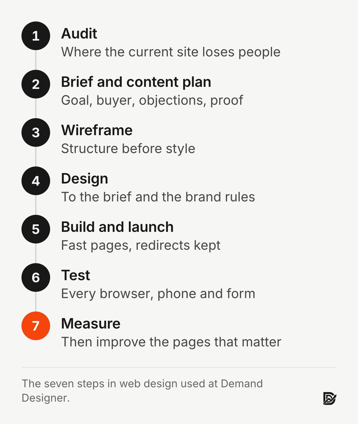
The seven steps in web design are audit, brief and content plan, wireframe, design, build and launch, test, and measure, in that order. I use this sequence on every B2B website project. The long version is my seven-phase redesign playbook.
No standard seven-step list exists; web design process lists vary by author, and some split launch or content into their own steps. This is the order I use, and here is why each step sits where it does.
Step 1: Audit
Before changing anything, find out which pages buyers actually visit, where they leave, what the website says about the company, and what the search engines already rank. In my experience a redesign that starts in a design tool can lose the rankings the old site earned. Palmer (2002) is the reminder that what predicts a website's success is measurable before you start.
Step 2: Brief and content plan
One page: who the website is for, what they need, what the business needs from them, and how success will be measured. This is Garrett's strategy plane written down. Then the page-by-page outline and who writes each page, agreed before design starts, because the Thielsch (2013) finding says the content is what brings a buyer back.
Step 3: Wireframe
Structure before style. Where does each piece of content sit, in what order, with what next step. The Larson and Czerwinski (1998) finding on broad, shallow structures belongs here, as does the Hick and Iyengar evidence on choices.
Step 4: Design
Now the surface: type, colour, image, motion. This is where the first-impression research of Lindgaard and Tuch applies, and where the design trends are decided for or against. Accessibility standards are part of the design brief, not a check at the end.
Step 5: Build and launch
Build for speed and for search. Server-render the text. Keep every existing URL or redirect it, with the redirect map written before launch day. Compress every image. Wire the analytics events the brief named. The Core Web Vitals thresholds are the acceptance test, and a check that the new pages are indexed is the last task of launch week.
Step 6: Test
Every path, on real phones, with real content, by someone who did not build it. Everard and Galletta (2005) are the reason: the small presentation errors are the ones that cost trust.
Step 7: Measure
After launch, the website is a hypothesis. Measure the conversions you briefed, compare them with the audit, and change the pages that matter. Javier Bargas-Avila and Kasper Hornbæk reviewed 66 empirical studies of user experience for CHI. Most measured emotions, enjoyment and aesthetics, usually through questionnaires. The authors called for more measurement of actual behaviour over time (Bargas-Avila and Hornbæk, 2011, doi:10.1145/1978942.1979336). On a commercial website the behaviour is the point: forms submitted, calls booked, deals that mention the website.
Teams ask me whether the seven steps can be compressed. They can, if the brief exists. The Snappy Kraken front-end build went from approved Figma designs to a live HubSpot site in 21 days because the audit and the brief were already done. Skipping steps one and two is what makes the later steps slow.
Sources
Peer-reviewed research
Lindgaard, G., Fernandes, G., Dudek, C. and Brown, J. (2006). Attention web designers: You have 50 milliseconds to make a good first impression! Behaviour and Information Technology, 25(2). doi:10.1080/01449290500330448
Tuch, A. N., Presslaber, E. E., Stöcklin, M., Opwis, K. and Bargas-Avila, J. A. (2012). The role of visual complexity and prototypicality regarding first impression of websites. International Journal of Human-Computer Studies, 70(11). doi:10.1016/j.ijhcs.2012.06.003
Reinecke, K., Yeh, T., Miratrix, L., Mardiko, R., Zhao, Y., Liu, J. and Gajos, K. Z. (2013). Predicting users' first impressions of website aesthetics with a quantification of perceived visual complexity and colorfulness. Proceedings of the SIGCHI Conference on Human Factors in Computing Systems. doi:10.1145/2470654.2481281
Fogg, B. J., Soohoo, C., Danielson, D. R., Marable, L., Stanford, J. and Tauber, E. R. (2003). How do users evaluate the credibility of Web sites? Proceedings of the 2003 Conference on Designing for User Experiences. doi:10.1145/997078.997097
Nah, F. F.-H. (2004). A study on tolerable waiting time: how long are Web users willing to wait? Behaviour and Information Technology, 23(3). doi:10.1080/01449290410001669914
Galletta, D. F., Henry, R., McCoy, S. and Polak, P. (2004). Web site delays: How tolerant are users? Journal of the Association for Information Systems, 5(1). doi:10.17705/1jais.00044
Flavián, C., Guinalíu, M. and Gurrea, R. (2006). The role played by perceived usability, satisfaction and consumer trust on website loyalty. Information and Management, 43(1). doi:10.1016/j.im.2005.01.002
Cyr, D. (2008). Modeling web site design across cultures: Relationships to trust, satisfaction, and e-loyalty. Journal of Management Information Systems, 24(4). doi:10.2753/mis0742-1222240402
Hick, W. E. (1952). On the rate of gain of information. Quarterly Journal of Experimental Psychology, 4(1). doi:10.1080/17470215208416600
Iyengar, S. S. and Lepper, M. R. (2000). When choice is demotivating: Can one desire too much of a good thing? Journal of Personality and Social Psychology, 79(6). doi:10.1037/0022-3514.79.6.995
Scheibehenne, B., Greifeneder, R. and Todd, P. M. (2010). Can there ever be too many options? A meta-analytic review of choice overload. Journal of Consumer Research, 37(3). doi:10.1086/651235
Chakraborty, Lala and Warren (2002). An empirical investigation of antecedents of B2B Websites' effectiveness. Journal of Interactive Marketing, 16(4). doi:10.1002/dir.10044
Aggarwal, P., Murahari, V., Rajpurohit, T., Kalyan, A., Narasimhan, K. and Deshpande, A. (2024). GEO: Generative Engine Optimization. Proceedings of the 30th ACM SIGKDD Conference on Knowledge Discovery and Data Mining. doi:10.1145/3637528.3671900
Schmutz, S., Sonderegger, A. and Sauer, J. (2016). Implementing recommendations from web accessibility guidelines: Would they also provide benefits to nondisabled users? Human Factors, 58(4). doi:10.1177/0018720816640962
Thielsch, M. T., Blotenberg, I. and Jaron, R. (2013, online first; print 2014). User evaluation of websites: From first impression to recommendation. Interacting with Computers, 26(1). doi:10.1093/iwc/iwt033
Palmer, J. W. (2002). Web site usability, design, and performance metrics. Information Systems Research, 13(2). doi:10.1287/isre.13.2.151.88
Everard, A. and Galletta, D. F. (2005). How presentation flaws affect perceived site quality, trust, and intention to purchase from an online store. Journal of Management Information Systems, 22(3). doi:10.2753/mis0742-1222220303
Ozok, A. A. and Salvendy, G. (2000). Measuring consistency of web page design and its effects on performance and satisfaction. Ergonomics, 43(4). doi:10.1080/001401300184332
Larson, K. and Czerwinski, M. (1998). Web page design: Implications of memory, structure and scent for information retrieval. Proceedings of the SIGCHI Conference on Human Factors in Computing Systems. doi:10.1145/274644.274649
Lee, Y. E. and Benbasat, I. (2003). Interface design for mobile commerce. Communications of the ACM, 46(12). doi:10.1145/953460.953487
Moshagen, M. and Thielsch, M. T. (2010). Facets of visual aesthetics. International Journal of Human-Computer Studies, 68(10). doi:10.1016/j.ijhcs.2010.05.006
Bargas-Avila, J. A. and Hornbæk, K. (2011). Old wine in new bottles or novel challenges: A critical analysis of empirical studies of user experience. Proceedings of the SIGCHI Conference on Human Factors in Computing Systems. doi:10.1145/1978942.1979336
Textbooks, legal texts and industry sources (not peer reviewed)
Garrett, J. J. (2002). The Elements of User Experience: User-Centered Design for the Web. New Riders. Textbook.
Shneiderman, B. (1987, and later editions with Plaisant and others). Designing the User Interface: Strategies for Effective Human-Computer Interaction. Addison-Wesley. Textbook; the eight golden rules.
Rayport, J. F. and Jaworski, B. J. (2001). Introduction to e-Commerce. McGraw-Hill. Textbook; the 7 C's framework.
European Union (2019). Directive (EU) 2019/882 on the accessibility requirements for products and services (the European Accessibility Act), applicable from 28 June 2025. Legal text.
W3C Web Accessibility Initiative. Introduction to Web Accessibility, quoting Tim Berners-Lee. Standards body.
Google (2026). Web Vitals: Largest Contentful Paint 2.5 seconds, Interaction to Next Paint 200 milliseconds, Cumulative Layout Shift 0.1, at the 75th percentile of page loads. Checked 6 October 2026. Vendor source.
Vercel and MERJ (17 December 2024). The rise of the AI crawler. Vendor data on crawler JavaScript rendering, not peer reviewed.
WebAIM (2026). The WebAIM Million: the 2026 report on the accessibility of the top 1,000,000 home pages. Industry source, automated detection only.
Sailop (28 April 2026). AI Slop in 2026: The State of the AI-Generated Web. Vendor-funded industry report; the authors describe their percentages as approximations.
Snappy Kraken, Y Scouts and project figures: Demand Designer client reporting, first-party experience, not research.
Free workbook
Pipeline Leak Scorecard
Find the leaks between your traffic and your pipeline. Score your site in about fifteen minutes, with it open in front of you.
12 questions, 8 pages, 15 minutes. Free.


