Web Design
7 Landing Page vs Website for Google Ads Checklist

Joshua Jackai
17 min

By Joshua Jackai, founder of Demand Designer · Published 19 October 2026 · Last updated and fact-checked 19 October 2026
Short answer: A focused landing page suits Google Ads when the offer is one step, such as a demo, and the buyer decides fast. A campaign page inside your site, with links to proof, suits large or slow B2B deals. Google scores landing page experience on how relevant and useful the page is to the person who clicked, so match the promise.
B2B marketers ask this in forums such as r/PPC, and the answers split into "always a landing page" and "a good site wins". The pages that rank for it are agency blog posts that sell their own landing page service, and none of the ones I read reports a controlled test. I am Joshua Jackai, founder of Demand Designer, a US studio that builds B2B websites on Framer, HubSpot and WordPress. I read Google's own definition of landing page experience, five peer-reviewed papers and the vendor claims, and I kept my own opinions labelled as opinions. I have not run a split test across client accounts, so the rules below are a decision order, not a benchmark. The missing piece in the existing advice is a rule by deal size and sales cycle, with qualified pipeline as the score. That is what this guide gives you.
Two terms, as I use them here: a landing page is a standalone page built for one ad promise and one action. A campaign page is a page inside your main site, built for one ad group, that keeps a route to cases, pricing and security.
Key takeaways
Google defines landing page experience as "how relevant and useful your landing page is to people who click your ad", and it is one of three components of Quality Score (Google Ads Help, landing page experience).
Google also says Quality Score is not an input in the ad auction. It is a diagnostic, so a page change shows up in your costs and conversions, not as a score reward.
In a panel of several hundred keywords from one US retailer, a higher landing page quality score went with higher conversion rates and a lower cost per click (Ghose and Yang, Management Science, 2009).
Visitors form a first impression of a page's visual appeal in 50 milliseconds, which is why the first screen of either choice matters (Lindgaard, Fernandes and Dudek, 2006).
One agency argues a siloed page may not suffice for B2B products priced from about $10,000 to $1,000,000 (Konstruct Digital, vendor blog, read 19 October 2026).
Rule | Question it answers | Lean landing page when | Lean website or campaign page when |
|---|---|---|---|
1. Deal size | How much proof does the buyer need? | Offer is low risk, such as a demo | Deal is large and committee-bought |
2. Sales cycle | How long until revenue? | Cycle is short | Cycle is long and gets researched |
3. Keyword intent | What did they type? | Specific, ready to act | Broad, still comparing |
4. Message match | Does the page repeat the ad promise? | You can build one page per promise | One page cannot match every ad group |
5. Choice | How many paths on the page? | One action | Two or three paths that you measure |
6. First screen | What shows in 50 ms? | Offer, proof and form | Brand, offer and a clear route |
7. Test | Which page makes pipeline? | Same budget, same keywords, qualified leads | Same |
1. Does deal size decide it? Best for setting your starting point
Deal size is the first filter. A page for a low-risk, one-step offer such as a demo, a quote or a download can stand alone. A page for a large purchase usually has to hold more proof, because the buyer checks you before talking to you. Start from price, then adjust.

Low-risk offer: one page, one action, one form
Large deal: the page plus proof pages (cases, pricing, security)
One agency view: siloed pages may fall short from about $10,000 to $1,000,000 (Konstruct Digital, vendor blog)
My build tiers: $3,250 to $14,999, first-party price table, October 2026
The only price-based rule I found in the ranking pages is the Konstruct one, and it is an agency opinion without a sample behind it, so treat the dollar range as a prompt to ask, not a threshold. Konstruct Digital's logic is sound: a buyer spending six figures wants to look around before filling in a form. If your deal is large, your ad can still land on a dedicated page. That page just needs a way to the proof.
The Konstruct argument is that buyers of expensive products need more information and engagement before committing, so a siloed page can fall short (Konstruct Digital, vendor blog, read 19 October 2026). Another agency, Directive, says targeted content increases conversions, but its April 2020 post gives no figures (Directive Consulting, vendor blog). I rank deal size first and trust it least, because it is the most quoted rule and the least measured.
My hypothesis, which I have not tested across accounts, is that a page asking a stranger for a demo does better with one case study and a named person on it. I would test it. Start by writing the price of your smallest sale and the price of your typical sale. If they differ by a factor of ten, you may need two page types, one per ad group.
"A page that asks a stranger for a demo needs a reason to trust the stranger first," said Joshua Jackai, founder of Demand Designer.
2. How long is the sales cycle? Best for deciding how much the page must carry
A short cycle lets one page do the whole job. A long cycle means the click is the start of research, so the buyer will look for more pages, and a page with no route onward sends them to search again. Count the days from first click to closed deal, then match the page to that.
Short cycle: the page asks for the contact and ends there
Long cycle: the page asks for a smaller step and links to evidence
Measurement lag: conversions can arrive well after the ad, which a display advertising study had to model (Chapelle, KDD 2014)
Check: compare form fills with sales accepted leads, not only form fills
Delayed conversions affect a page test as well as the page itself. Chapelle studied display advertising, not search or B2B, and described how conversions that arrive late bias a model that treats them as non-conversions (Chapelle, KDD 2014). I infer the same trap hits a page test: if you stop a test after a week, the page that collects the early form fills may look best while the other would have produced more sales. Match the test length to your cycle.
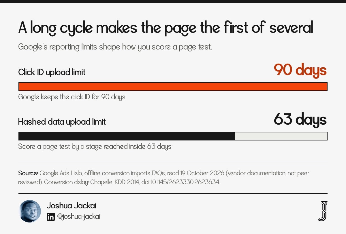
Google keeps a Google Click ID for 90 days, and an upload matched on personal data such as a hashed email can be no older than 63 days (Google Ads Help, offline conversion imports FAQs). That limits what Google can see, not how you score the test: your CRM can keep scoring for as long as your cycle runs. If you want Google to learn from the page, report a stage your team reaches inside those windows.
As a rule of thumb from my own work, not a measured threshold, if your cycle is longer than 60 days I would send paid clicks to a campaign page that links out to cases and pricing, and I would measure the stage your sales team agreed on.
"A long cycle turns the landing page into the first of several pages, not the only one," said Joshua Jackai, founder of Demand Designer.
3. What did the person type? Best for matching page type to intent
Specific searches earn specific pages. Someone who types a product, a price or "book a demo" is ready to act, so a focused page fits. Someone who types a broad phrase is still comparing, so a page with a route to more information fits. Group your keywords by how ready the searcher is before choosing.

Ready to act: the keyword names the product or the action
Comparing: the keyword names a category or a problem
Evidence: in one retailer panel, conversion rates were highest at the top ad position and fell with rank (Ghose and Yang, 2009)
Action: split ad groups by readiness, then pick a page per group
Ghose and Yang's paper shows that conversion differs by keyword and position. I infer that one page for every keyword is rarely right. In their data, conversion rates were highest at the top ad position and fell with rank, yet profits were often higher at the middle positions (Ghose and Yang, 2009). That is a retailer sample, so I use it only for the point that keywords are not equal. For B2B, I read the same split as intent.
I do not claim this retailer pattern holds for B2B search. Ghose and Yang studied several hundred keywords from one nationwide retailer over six months, so the point I take from it is only that keyword and position change the value of a click. The lesson for a B2B account is to read the search terms report before choosing, and, as a rule of thumb, to give your most expensive terms their own page.
In practice I sort the search terms report into three piles: terms with the product name, terms with a problem, and terms with a category. Each pile gets its own ad group and its own landing target. The problem pile often goes to a blog-style campaign page, the product pile to a focused page.
"One page for every keyword means one compromise for every searcher," said Joshua Jackai, founder of Demand Designer.
4. Does the page repeat the ad promise? Best for landing page experience
Message match means the headline on the page repeats the promise in the ad. Google scores landing page experience as relevance and usefulness to the person who clicked. A homepage rarely repeats one ad's promise, which is the real argument for a campaign page, not the missing navigation bar.

Google's definition: "How relevant and useful your landing page is to people who click your ad" (Google Ads Help)
Where it counts: one of three Quality Score components
Caveat: Google says Quality Score is not an input in the auction
Retailer panel: higher landing page quality scores went with higher conversion rates and lower cost per click (Ghose and Yang, 2009)
Ghose and Yang's finding was an association in one retailer's data from 2009, not a test of landing pages against websites. It does support the idea that a page which fits the ad is worth building.
"an increase in landing page quality scores is associated with an increase in conversion rates and a decrease in advertiser's cost per click," wrote Ghose and Yang in Management Science (2009)
Google adds a limit worth knowing: Quality Score is not an input in the ad auction, so building a matching page will not raise your rank by the score alone (Google Ads Help, landing page experience). The gain comes from visitors who find what the ad promised. When I audit an account, I open the ad, click it, and read the first headline aloud. If the headline does not repeat the words of the ad, I mark that ad group for a new page before touching bids.
The cheapest fix is often on the website you already have. If your site has a page that matches the ad's promise, send the ad there. If it has none, build one page for that ad group, in the site's own template, so the visitor can still reach the rest of the site.
"The question is not landing page or website. It is whether any page repeats what the ad promised," said Joshua Jackai, founder of Demand Designer.
5. How many paths should the page offer? Best for the navigation question
Fewer exits help when you want one action. More paths help when the buyer needs to research. The classic experiment on choice found fewer options led to more purchases, but it was a jam tasting, so I treat it as a reason to test, not a law for B2B pages.
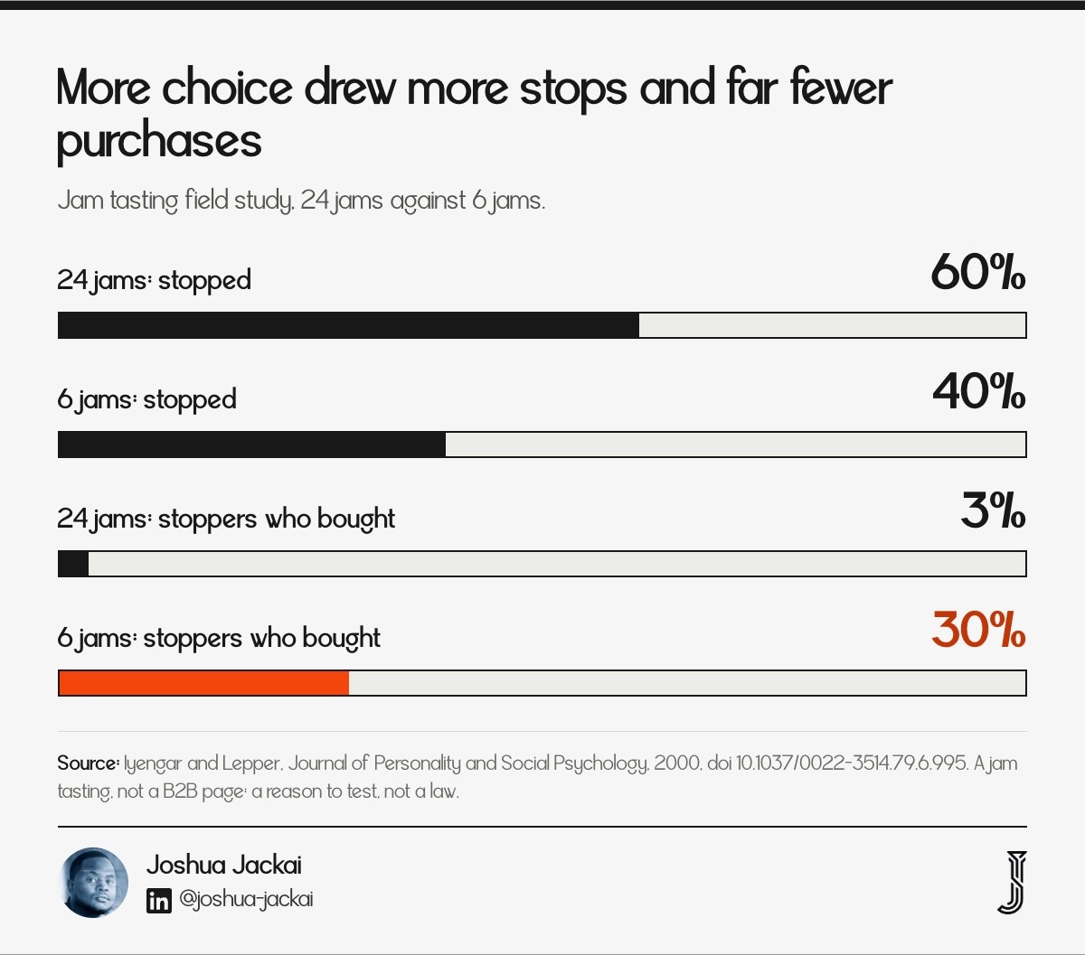
Field study: a table with 24 jams drew more stops than one with 6, but far fewer purchases among those who stopped (Iyengar and Lepper, 2000)
Page version: one primary action, plus at most two measured secondary paths
Trap: a full navigation bar adds paths you are not measuring
Compromise: a slim header with the logo and one link to proof
In the jam study, 60% of passers-by stopped at the 24-jam display and 3% of those who stopped bought, while 40% stopped at the 6-jam display and 30% of those who stopped bought (Iyengar and Lepper, 2000). Jam is not software, and shoppers are not buyers committees. What carries over is the cost of extra paths when the goal is one action.
The extra paths cost more when the buyer is already decided. When a visitor arrives from a search for your product name, every link away from the form is a chance to leave. When the visitor is comparing, the same links are how they get the proof they came for. That is why intent from rule 3 should set how many paths you keep, and why I count them on the page before launch.
My rule is to keep paths that answer a buyer question the page raises, such as pricing or security, and to cut the rest. A "Careers" link on a demand page answers no buyer question.
"Keep the links that answer a question the page raises and cut the links that answer none," said Joshua Jackai, founder of Demand Designer.
6. What does the first screen show? Best for the 50 millisecond problem
Visitors judge a page almost instantly, so the first screen of a landing page or a website needs the offer, a proof point and the next step. The paper that measured this reported that people form a first impression in 50 milliseconds, and later judgements mostly agreed with it.
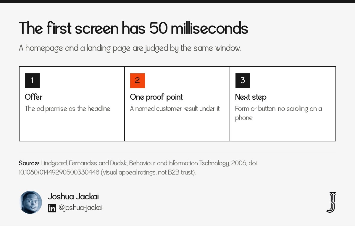
Study: people rated pages after 50 ms and again later, with high agreement (Lindgaard, Fernandes and Dudek, 2006)
First screen: offer, one proof point, one action
Website risk: a homepage first screen speaks to everyone, so it speaks to no one
Landing page risk: a bare form with no name or proof looks like a trap
The title of the paper makes the claim: "You have 50 milliseconds to make a good first impression" (Lindgaard, Fernandes and Dudek, 2006). The participants rated visual appeal, not B2B trust, so I use it for the point that the first screen carries the load.
The same paper's participants judged very short exposures against longer ones, and the ratings agreed closely, which suggests the first screen is judged very quickly. The paper does not test whether a poor first impression can be recovered from (Lindgaard, Fernandes and Dudek, 2006). Notice what that means for the argument. A homepage and a landing page are judged by the same 50 milliseconds, so the first screen, not the page label, carries the decision. In my opinion a slow page loses that window before it shows anything, so check load time on a phone too.
For a campaign page I put the ad's promise as the headline, one named customer result under it, and the form or button beside it. Then I load the page on a phone and check that all three show without scrolling.
"The first screen has about 50 milliseconds to say who you are and what happens next," said Joshua Jackai, founder of Demand Designer.
7. How do you test it? Best for settling the argument with your own traffic
Run one controlled test: the same keywords, the same budget, a random split between the two pages, and qualified leads as the score. Most forum threads end with "test it". Few say how, and form fills alone will mislead you because the cheaper page often collects worse leads.

Method: a controlled online experiment with random assignment (Kohavi, Longbotham and Sommerfield, 2008)
Split: two campaigns with equal budgets, or a visitor-level page testing tool
Score: cost per sales accepted lead, then pipeline
Length: at least one full sales cycle for the pipeline, with form fills reported weekly
Kohavi and colleagues wrote the standard survey of online controlled experiments, with practical advice on running them (Kohavi, Longbotham and Sommerfield, 2008). Their point that fits here is that you need random assignment, not before-and-after comparisons, or seasonality and budget changes get mixed into the result.
The standard design is two arms that differ in one thing, shown to randomly assigned visitors at the same time, and analysed with a pre-set metric and run length (Kohavi, Longbotham and Sommerfield, 2008). In Google Ads that can mean two campaigns with equal budgets, the same keywords and the same bids, each with its own final URL, or a page-testing tool that randomises at visitor level. Change one thing at a time. If the new page also has a new offer, you will not know which change made the difference.
Small accounts cannot reach a clean answer in a few weeks. If you get few clicks a week, as a rule of thumb under 100, test one big difference, such as focused page against the current site page, and read the result as a direction. To compare the two pages, use the cost per qualified lead formula in the matrix section.
"The page that makes the cheapest lead is not the page that makes the cheapest customer," said Joshua Jackai, founder of Demand Designer.
Compare the seven rules and apply them to your account
Use this matrix to see which rules point to a landing page and which point to the website. Count the rules that lean each way for your account. If they split, build the campaign page and test it against your current site page.
Rule | Landing page signal | Website or campaign page signal | Evidence type |
|---|---|---|---|
1. Deal size | Low risk, one step | Large deal, many buyers | Vendor opinion |
2. Sales cycle | Short | Long, researched | Analogy from a study (display ads) |
3. Keyword intent | Product or action term | Category or problem term | Analogy from a study (retailer) |
4. Message match | Page per ad promise | Existing page already matches | Google documentation, plus a retailer study |
5. Choice | One action | Measured paths to proof | Analogy from a study (jam tasting) |
6. First screen | Offer, proof, form | Brand, offer, route | Analogy from a study (visual appeal) |
7. Test | Randomised split | Randomised split | Method from a survey of experiments |
To compare two pages, divide your ad spend by form fills multiplied by the share your sales team accepts. The page with the lower cost per qualified lead wins that round.
Frequently asked questions about landing pages and websites for Google Ads
Is a landing page better than a website for Google Ads?
No, a landing page is not always better than a website for Google Ads. A focused page fits one-step offers, and a large or slow deal often needs proof pages. Google scores how relevant and useful the page is to the person who clicked. Test both on qualified leads.
Should I send Google Ads traffic to my homepage?
Sending Google Ads traffic to your homepage is rarely the best choice. A homepage speaks to every visitor, so it seldom repeats one ad's promise. If another page on your site matches the ad, send the click there. If none does, build one campaign page in your site template.
Does a landing page improve Quality Score?
It can improve landing page experience, one of three Quality Score components. Google says Quality Score is a diagnostic and not an input in the auction, so judge a page by conversions and cost per qualified lead, not by the score.
What is the difference between a landing page and a website?
A landing page is a standalone page built for one ad promise and one action. A website is the full set of pages, with navigation to cases, pricing and security. A campaign page sits between them: one page per ad group, inside your site template.
Do landing pages need navigation for B2B?
Keep the links that answer a buyer question, such as pricing, security or cases, and cut the rest. For a short cycle, one action is enough. For a long cycle, a slim header with one route to proof is a safer start.
How I set this up for B2B teams
I build B2B marketing sites on Framer, HubSpot and WordPress at fixed prices from $3,250 to $14,999. For paid search, I build one campaign page per ad group inside the site template. The Pipeline Leak Scorecard checks the form, the page and the CRM stage in fifteen minutes and is free.
Sources
Peer reviewed
Ghose, A. and Yang, S. (2009). An empirical analysis of search engine advertising: sponsored search in electronic markets. Management Science. doi.org/10.1287/mnsc.1090.1054
Iyengar, S. S. and Lepper, M. R. (2000). When choice is demotivating: can one desire too much of a good thing? Journal of Personality and Social Psychology. doi.org/10.1037/0022-3514.79.6.995
Lindgaard, G., Fernandes, G. and Dudek, C. (2006). Attention web designers: you have 50 milliseconds to make a good first impression! Behaviour and Information Technology. doi.org/10.1080/01449290500330448
Kohavi, R., Longbotham, R. and Sommerfield, D. (2008). Controlled experiments on the web: survey and practical guide. Data Mining and Knowledge Discovery. doi.org/10.1007/s10618-008-0114-1
Chapelle, O. (2014). Modeling delayed feedback in display advertising. Proceedings of the 20th ACM SIGKDD International Conference on Knowledge Discovery and Data Mining. doi.org/10.1145/2623330.2623634
Industry and vendor
Google Ads Help. Offline conversion imports FAQs, read 19 October 2026. support.google.com/google-ads/answer/10029210. Vendor documentation, not peer reviewed.
Directive Consulting. Landing page vs homepage, April 2020, read 19 October 2026. directiveconsulting.com. Agency blog, opinion, not peer reviewed.
Google Ads Help. About landing page experience, read 19 October 2026. support.google.com/google-ads/answer/2404197. Vendor documentation, not peer reviewed.
Konstruct Digital. B2B PPC landing pages, read 19 October 2026. konstructdigital.com. Agency blog, opinion, not peer reviewed.
The rules, the decision order, the test design and the first screen checks are my own reasoning from the sources above. Build prices are Demand Designer's fixed-price tiers, October 2026. First-party.
Free workbook
Pipeline Leak Scorecard
Find the leaks between your traffic and your pipeline. Score your site in about fifteen minutes, with it open in front of you.
12 questions, 8 pages, 15 minutes. Free.