Web Design
Paid Ads & Creative
How to Build a Visual Identity People Remember

Joshua Jackai
6 min

A visual identity is the small set of rules that makes everything a company puts out look like it came from the same place: the mark, two typefaces, a handful of colours, how photos are treated and how pages are laid out. It is not a logo, and it is not a 60-page brand book nobody opens. This guide explains why a consistent visual identity sells, what the research says about first impressions, and how to build one in a week with a one-page sheet and a few templates. It is for founders and marketing leads at small and mid-sized companies in the US and worldwide who are tired of their site, their decks and their social posts looking like three different businesses.

Illustrative photo.
Why visual identity matters more than it should
People judge a company by how it looks long before they read what it says. In a study published in Behaviour & Information Technology, people formed a reliable opinion of a web page's visual appeal in 50 milliseconds, and those snap ratings matched their ratings after a longer look (Lindgaard et al., 2006). In a Stanford study of more than 2,600 people evaluating real websites, the look and design of a site was the factor they mentioned most often when judging whether to trust it, in close to half of all comments (Fogg et al., 2003).
There is a mechanism behind this. Research on processing fluency shows that people judge things they can take in easily more favourably, and treat that ease as a sign the thing is right (Reber, Schwarz and Winkielman, 2004). A consistent identity is easy to take in: the eye learns the rules on the first page and stops working on the second. An inconsistent one makes every page a new effort, and buyers read that effort as a signal about the company.

What a visual identity actually contains
Keep the list short. Everything that matters fits on one page:
The mark. A wordmark or symbol, with a rule for its minimum size and clear space, and a version for dark backgrounds.
Two typefaces. One for headlines, one for body text, with three or four sizes each. Choose faces that suit the company's age and audience; the defaults every template uses make you look like every template.
Three colours. A dark, a light, and one accent used for the one thing on each page you want clicked. More accents mean no accent.
An image rule. Real photos of real work, treated the same way every time: the same crop, the same colour grade, no stock photos of handshakes.
A layout rule. Margins, a spacing scale, one button style, one card style.
A voice line. One sentence on how the company writes, because words are part of how it looks.
For Demand Designer, that page is Ink, Paper and one orange accent, one type scale, borders instead of drop shadows, and a mark that works at 16 pixels. Every graphic in this article follows it, which is the point.

Two pages from the Demand Designer design system, version 1.5.
Step 1: Decide what the identity has to do
Start with the audience and the job, not with colours. Who sees this most often, and what should they conclude in half a second? A law firm selling to in-house counsel wants "careful and established." A video studio selling to marketing teams wants "fast and current." Write that conclusion down in one line. Every later choice is tested against it.
Then look at the five competitors a buyer would compare you with. Put screenshots of their homepages side by side. If four of them use the same blue and the same rounded cards, that is the look to avoid, because the goal is to be recognised, not to blend in. One different choice, in type or colour or layout, is usually enough.
Step 2: Build the one-page sheet
Make the six decisions above and put them on a single page, with real examples: the mark at three sizes, the two typefaces set as a headline and a paragraph, the three colours with their hex codes, one photo treated correctly and one treated wrongly, a button, a card. This is the whole system. If a decision does not fit on the page, it is not a rule yet.
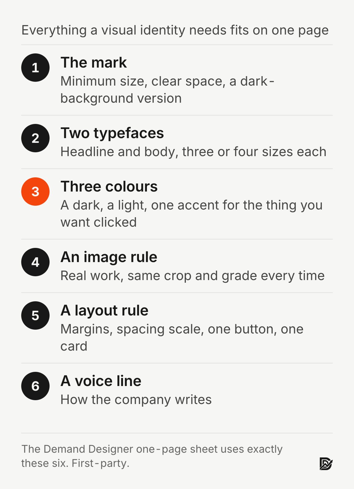
A one-page sheet is not a lesser version of a brand book. It is the part of the brand book people would have used, and because it fits on a wall, they do.
Step 3: Apply it to the five things people see
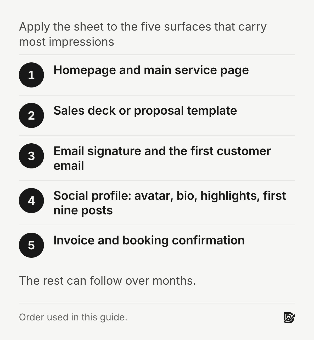
Do not try to update everything. Apply the sheet to the five surfaces that carry most of the impressions:
The website's homepage and main service page.
The sales deck or proposal template.
The email signature and the first email new customers receive.
The social profile: avatar, bio, highlights and the first nine posts.
The invoice and the booking confirmation, because customers see them at the moment of deciding to pay.
Once those five match, the rest can follow over months. The B2B website redesign playbook covers the website part in detail, and seven B2B website mistakes explains what an inconsistent site costs in lost deals.

Illustration with example content: a one-page brand sheet.
Step 4: Make templates so the rules survive
An identity breaks when someone makes a new deck at 11pm with whatever font was open. Templates stop that:
A slide deck with title, section, two-column and quote layouts.
A social post set: one for a quote, one for a stat, one for a photo with a caption.
A document template for proposals and reports.
A web page section library, if the site platform supports it.
Each template encodes the rules, so nobody has to remember them. This is also where consistency becomes cheap: the second deck takes an hour instead of a day.
Step 5: Write the voice line next to the visuals
Visual identity and voice are judged together. A clean, quiet layout with copy full of exclamation marks and "game-changing solutions" reads as fake. Put one sentence on the sheet about how the company writes: who speaks (I or we), how formal, what is banned. Then check the five surfaces against it. How to market your brand on social media shows how the same pillars and voice carry into a posting plan.
What a visual identity is not
It is not a logo redesign, which changes the one element people have already learned to recognise. It is not a trend; the shapes and gradients every AI page generator produces this year will date in two. And it is not a substitute for proof. A beautiful site with no client names, no numbers and no process still loses to an ugly one that shows its work. Design earns the first look; evidence earns the call. How to build trust on a website covers the evidence side.
Frequently asked questions
What is the difference between a logo and a visual identity?
A logo is one element. A visual identity is the full set of rules, including the logo, the typefaces, the colours, the image treatment and the layout, that make everything the company produces look like one company. A good logo in an inconsistent identity still looks inconsistent.
How much does a visual identity cost?
For a small company, a one-page sheet and the five core templates is a one-to-two-week project, usually a few thousand dollars with a designer, or a few days of your own time with a clear brief. A full rebrand with new naming and a logo costs far more and is rarely what a small company needs.
How many colours should a brand have?
Three to do most of the work: a dark, a light and one accent. The accent goes on the single thing you want clicked on each page. Extra colours can exist for charts and tags, but they are not part of the identity people learn.
Should I use a template or hire a designer?
Use a template to get started if budget is tight, but change the defaults: the typeface, the colour, the card style. An unchanged template looks like every other company that used it. A designer earns their fee by making the one or two choices that set you apart and by building the templates that keep them.
How do I keep a visual identity consistent across a team?
Put the one-page sheet where everyone can see it, build templates for the documents people make most, and review the five core surfaces once a quarter. Consistency is a process problem more than a design problem.
Sources
Peer-reviewed research
Fogg, B. J., Soohoo, C., Danielson, D. R., Marable, L., Stanford, J. and Tauber, E. R. (2003). How do users evaluate the credibility of Web sites? Proceedings of the 2003 Conference on Designing for User Experiences. doi:10.1145/997078.997097
Lindgaard, G., Fernandes, G., Dudek, C. and Brown, J. (2006). Attention web designers: You have 50 milliseconds to make a good first impression! Behaviour & Information Technology, 25(2). doi:10.1080/01449290500330448
Reber, R., Schwarz, N. and Winkielman, P. (2004). Processing fluency and aesthetic pleasure: Is beauty in the perceiver's processing experience? Personality and Social Psychology Review, 8(4). doi:10.1207/s15327957pspr0804_3
First-party (not peer reviewed)
The Demand Designer design system, version 1.5, is my own work; the example graphics in this article are built from it. Cost ranges are from my own project pricing.
Free workbook
Pipeline Leak Scorecard
Find the leaks between your traffic and your pipeline. Score your site in about fifteen minutes, with it open in front of you.
12 questions, 8 pages, 15 minutes. Free.


